
Mobile Usability Issue Emails
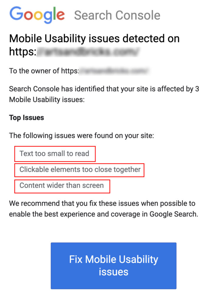
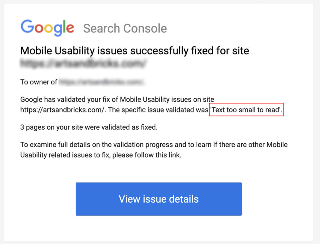
If you’ve registered your website with Google Search Console, then periodically you may receive emails notifying you when Mobile Usability issues have been detected. A notification may look similar to the screenshot below. They often highlight common errors such as “Text too small to read,” “Clickable elements too close together,” or “Content wider than screen.”
Helpful Tools
There are several helpful tools for testing and fixing Google Search Console’s flagged mobility issues on your webpage
My favorite tools for problem-solving these type of issues are:
- Google Search Console
- Bing Mobile Friendliness Tool
- Google Developer Tool Bar
Error: Text too small to read
The goal here is to make sure that on mobile devices, your text is legible and easily read without having to pinch and scale your view, increasing the font size.
In your CSS body or HTML tag, you can increase the size of all of your text in the mobile view. Depending on your set-up, use pixels, ems, or rems to proportionally increase the size of all text displayed on the page. I recommend using a media query to change the sizing ratios just on mobile. The success of this method is very dependent on how your theme and website are configured.
If you’re using a WordPress theme that has font sizes that are not easily changed or are using hard-coded sizes, you can override sizes using the percentage setting on CSS declaration font-size.
Font-size 100% means the fonts are rendered as declared by other CSS styles. Increasing above 100% calculates larger than the declared sizes.
The below code increases the font size in paragraphs within your WordPress blog entry, the p tag, only for screen sizes smaller than 480px.
@media screen and (max-width: 480px) {
   .entry-content p {
	font-size:105%;
    }
}
Error: Fixing Clickable Elements Too Close Together
For mobile devices, the tap target should be at least 48 pixels. Please note, that an icon in a button doesn’t need to be 48 pixels, but the entire button inclusive of the padding does need to meet this size. Learn more about accessible tap targets on web.dev.
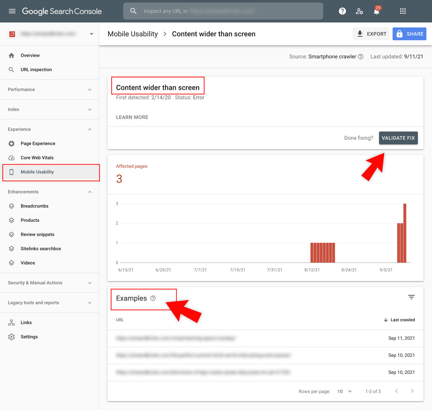
Error: Fixing Content Wider Than Screen Error
Use Google’s Mobile Friendly Tool on the pages that are marked as erroring for “Content Wider than Screen.” This FREE tool will fetch your page and analyze it for you.
I’ve found a few easy fixes that have worked for me to address this error issue and they may help you, too.
1. Set images to have a max-width of 100%
If an image is larger than a viewport, it can cause a scroll bar. An easy CSS fix for this is adding a max-width by default to all images on your site. You can learn more about this code on web.dev.
img {
  max-width: 100%;
  display: block;
}
2. Adjust overflow-x to hidden
You can always set the overflow-x (horizontal) to hidden. This can be set on the body of your webpage or an offending parent element.
body {
	overflow-x:hidden;
}
In Tailwind CSS, there’s a ready-to-go overflow utility class you can use called overflow-x-hidden.
Looking for your offending element?
My go-to way to find it is using Chrome Inspector. Click the + New Style Rule button. Add the following CSS. This will add a red outline box around all elements, including elements that go off your screen. Don’t forget to toggle the device bar, to inspect your design in mobile views.
* {
    outline: 1px solid red;
}
How do I know if I’ve had success?
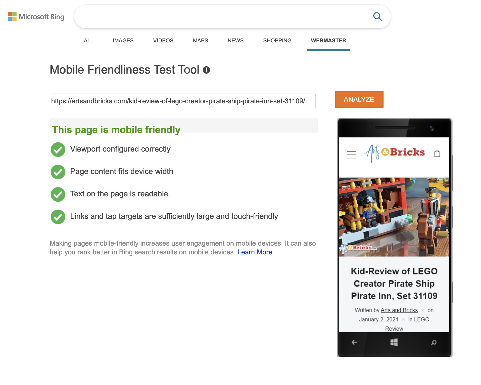
I recommend running your previously offending webpage through Bing’s Mobile Friendliness Test. If you’ve passed your results will show a green checkmark and read.
- Viewport configured correctly
- Page content fits device width
- Text on the page is readable
- Links and tap targets are sufficiently large and touch-friendly
You’ll also want to let Google know that you’ve made the fixes and ask them to review your site.
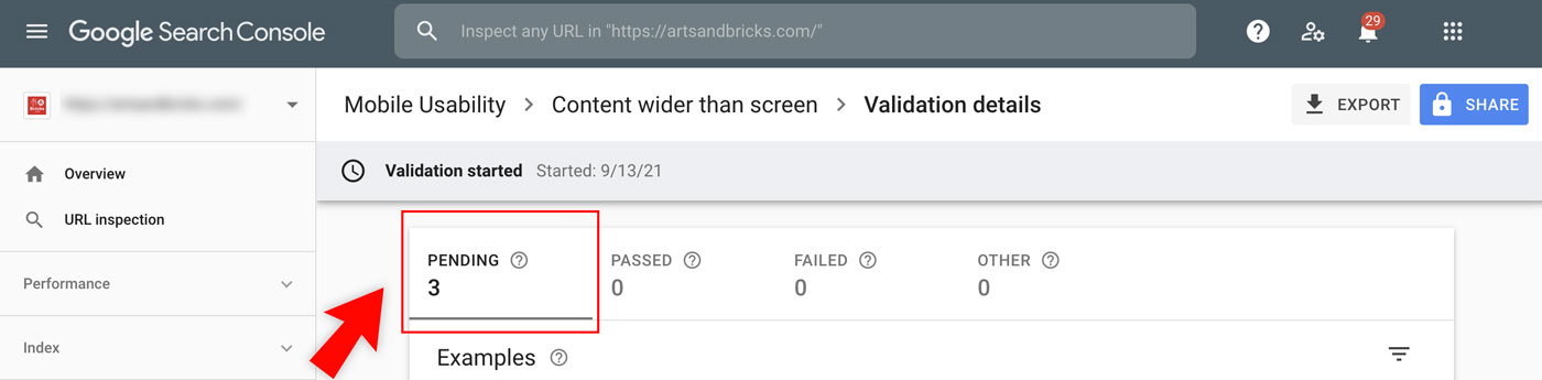
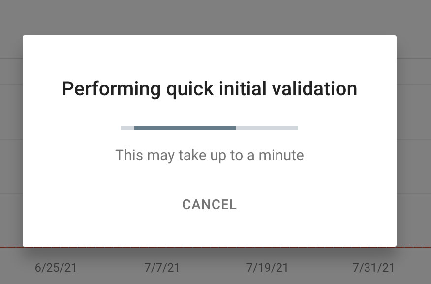
To re-validate the “Content is wider than the screen,” Google takes time. Once you’ve asked Google to revalidate you’ll see a screen that includes Pending,
For “Clickable Elements are too close together,” Google provides a quick validation. It will run through the currently flagged pages. If one of those pages fails, the system will tell you that it cannot finish the validation until that issue is fixed.
Frustrating Mobility Errors
In my experience, the Bing and Google test provide different results. Bing might give you a passing score while Google Search Console might still give you a failing score. It can be very frustrating and fixing the issue is a bit like chasing the wind!
The tricky offenders are often datelines, tags, keyword lists, footer navigations, and even ads that you’re serving on your website.
When you’ve made your fixes, don’t forget to validate in Google Search Console. When the validation is completely verified, you’ll receive a success email for each issue that is now fixed. Congratulations!
I hope one of these tips helps you validate your webpage in Google Search Console. Please share your successes and additional tips in the comments below.