Create Monograms in Illustrator
This post is based on the skills and exercises I teach my beginner design/advertising/public relations students during a project where we make logotypes using our initials. We use Adobe Illustrator to complete this project.
First, we look at this round-up of Two Letter Logo Designs for visual research and inspiration. Next, we talk about the techniques utilized in these designs. Then, we open Illustrator and recreate some of the logos we just looked at. Our logotype copycat process is fairly simple. We use type that we turn into outlines to create shapes that we can manipulate with the Pathfinder’s Unite and Divide tools.
Watch the videos below to see the process in action.
Learn to combine letters to form a logotype/monogram/or two-letter logo design.
Tips to overcome issues you may run into completing these copycat examples.
In this video, I walk through the essential gotchas you need to know when working with shapes, text, and the Pathfinder tool in Adobe Illustrator.
🧠 Key Tips to Keep in Mind:
- Fill & Stroke Layering – Check which layer (Fill or Stroke) is on top in your toolbar. The topmost one is active and will be applied when you click.
- Move vs. Direct Select Tools –
- The Move Tool (black arrow) moves entire shapes or groups.
- The Direct Select Tool (white arrow) lets you grab and edit specific anchor points or segments. Use Shift-click to select multiple points.
- Text Tool Behavior –
- Click + Drag to create a text box (paragraph text).
- Single Click to create a line of text.
For this project, we’re using line text.
- Create Outlines for Text – Convert your font-based letters into editable vector shapes by using Type > Create Outlines. If the option is grayed out, the text is already outlined.
- Always Select First – Before using Pathfinder or any transformation tool, make sure you’ve selected the objects on your canvas.
- Experiment Freely – Remember: Edit > Undo is your friend. Don’t be afraid to try things!
- Using the Line Tool – Lines need a stroke color to appear. Can’t see them? Use View > Outline mode to see all paths—even if they have no fill or stroke.
- Fixing Counterform Issues with Unite – If your letters are filling in weirdly when using Unite in Pathfinder, try this:
- Use the Direct Select Tool
- Hold Shift to select each part of the shape, but avoid selecting the inner counterform.
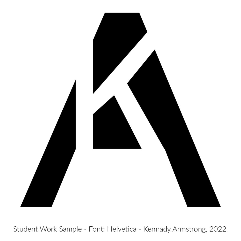
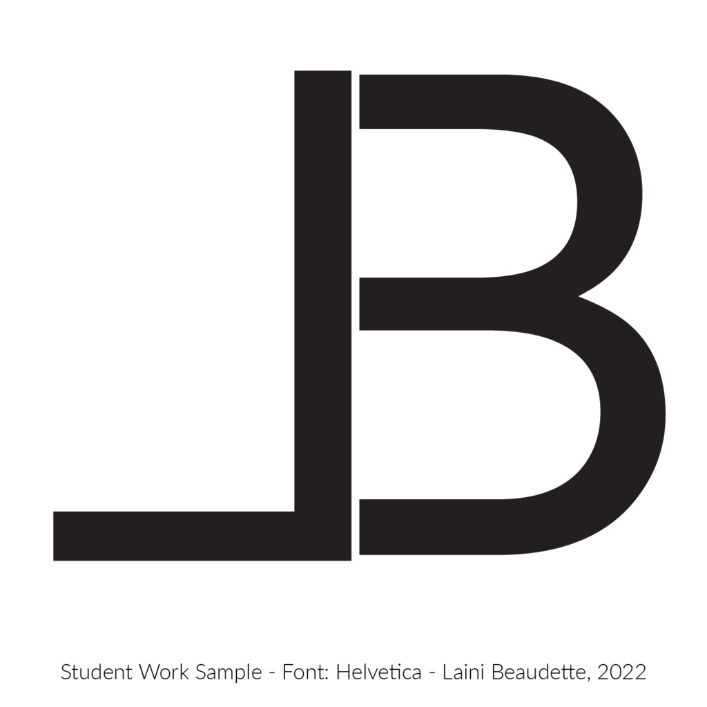
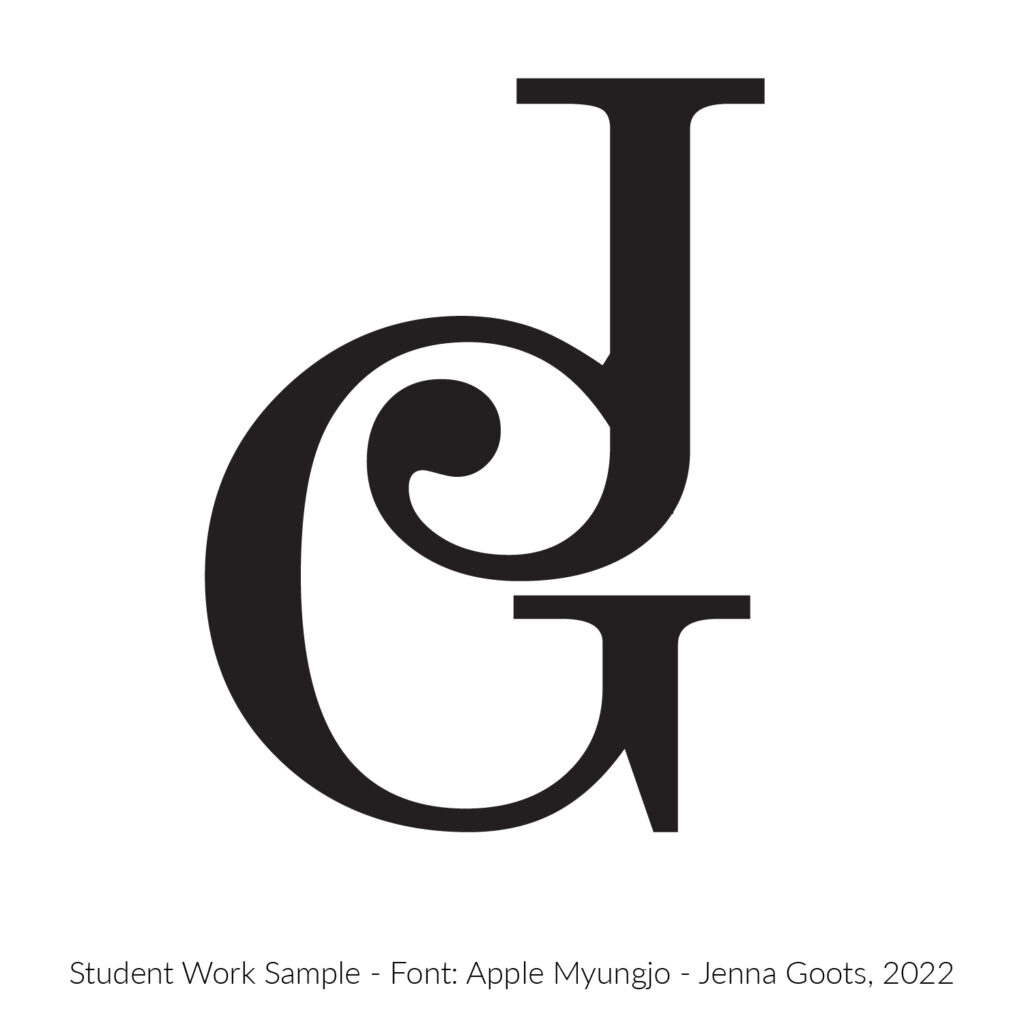
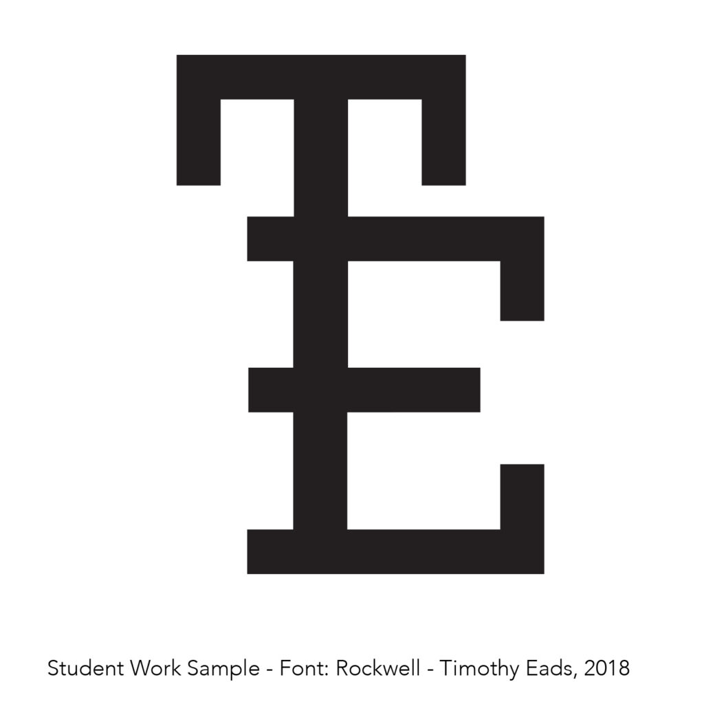
Student 2-Letter Logotype Samples
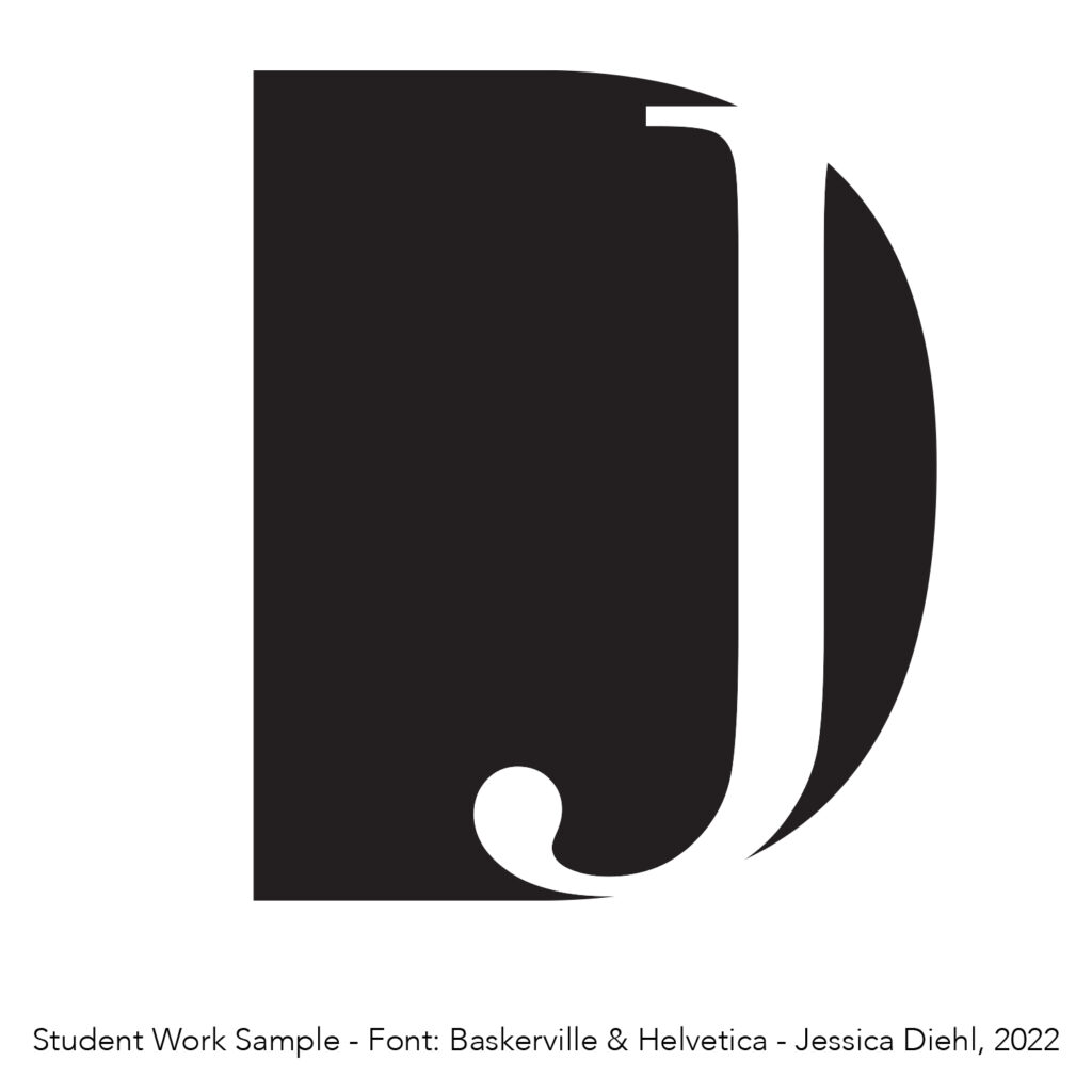
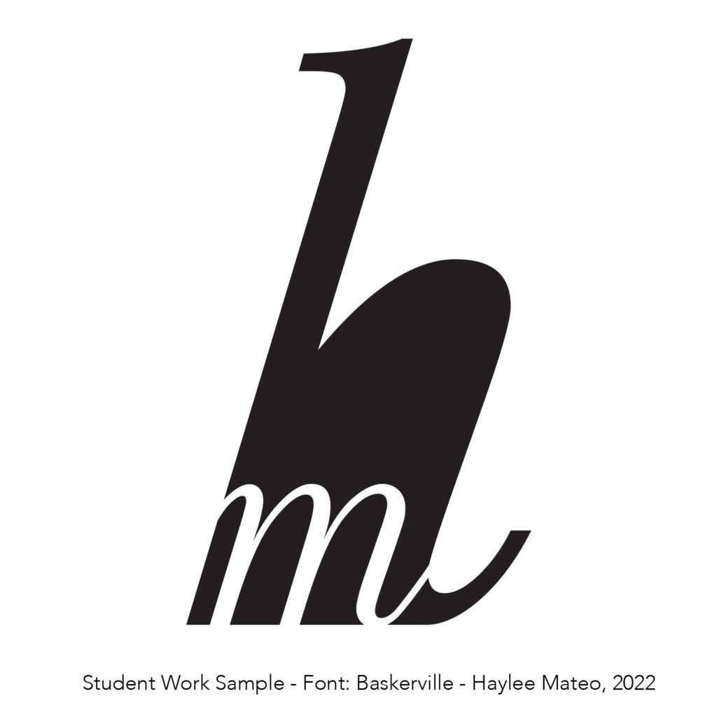
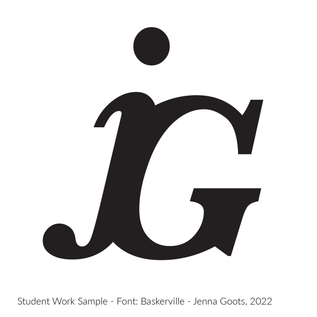
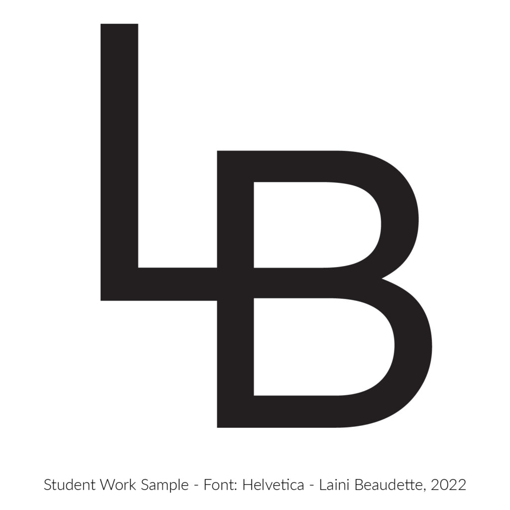
After learning a few common logotype-creation techniques, students use their initials to create personalized logotypes. Here are some of my favorite results.
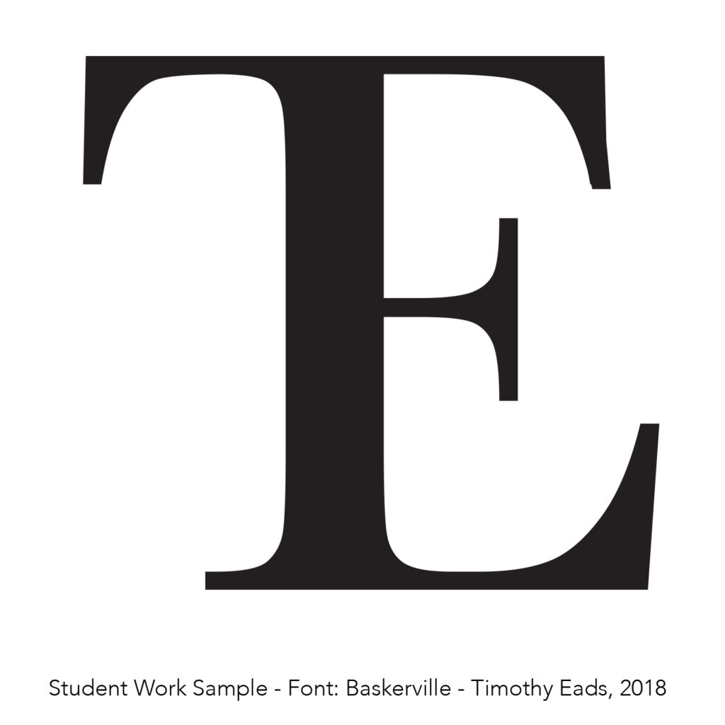
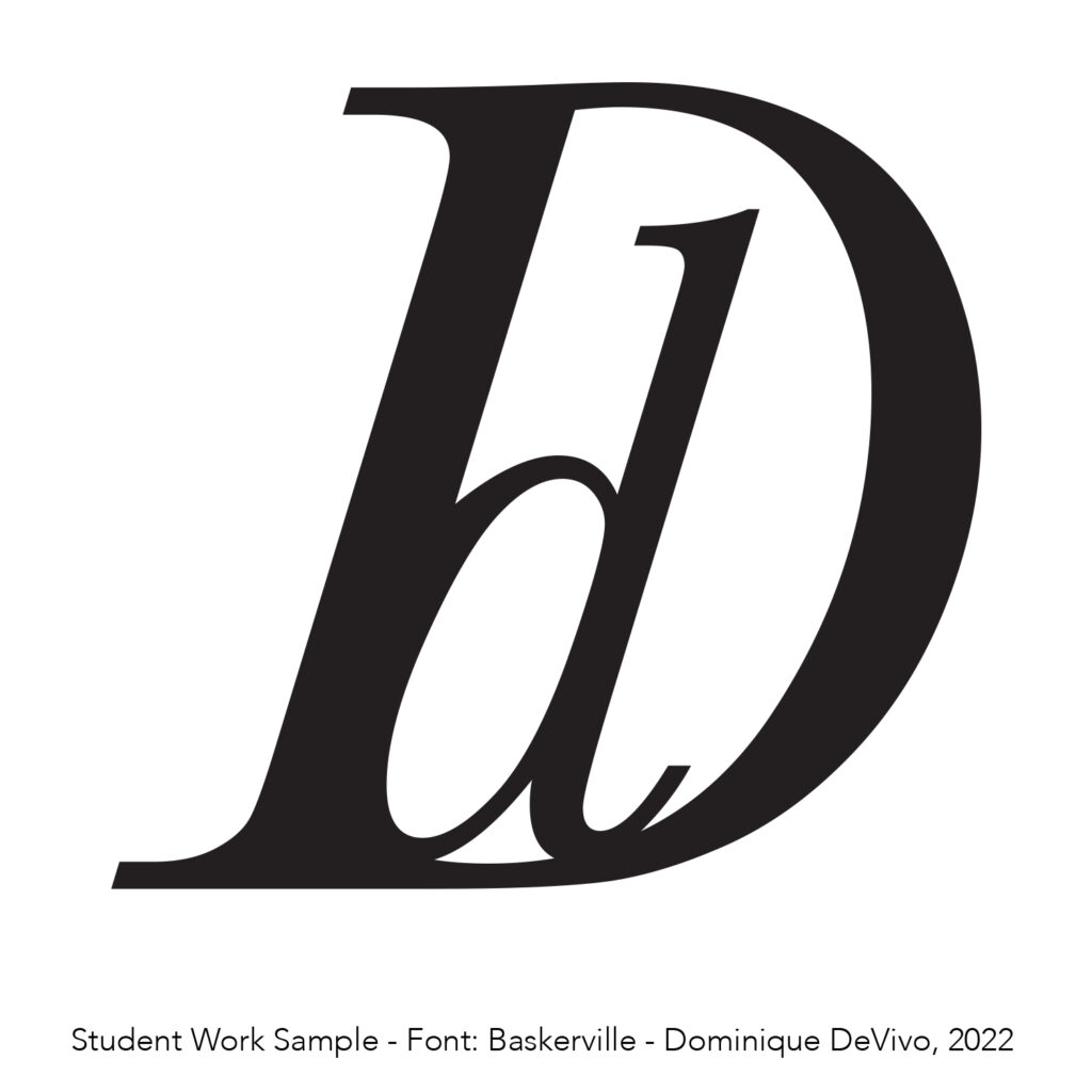
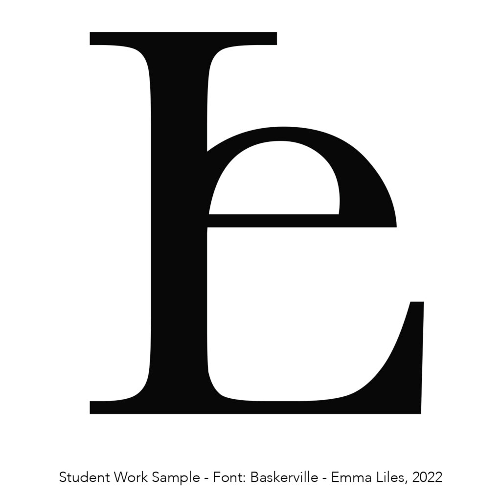
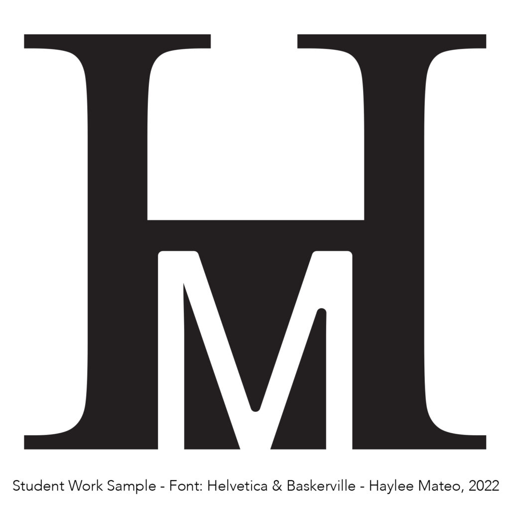
Professional logos with clever two-letter combination typography
Lost Nomad Brewing Company
The Lost Nomad Brewing Company‘s logo combines the letter “L” and letter “O” in a unique way that also represents the setting sun on the horizon line—designed by CODO Design of Indianapolis, a food and beverage branding firm.
Straight Ahead
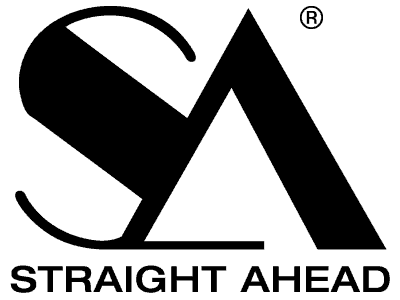
The Straight Ahead brand’s logo features a stylized capitalized S and A.

Metal Architecture
The Metal Architecture logo uses a capital M and lowercase a in its two-letter logotype.
Von Baer
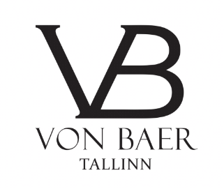
The designer leather bag brand’s logo uses a seriffed capital V and B with a shared stem to form their two-letter logotype.

The DA – Daily Athenaeum
The DA, the WVU Student Ne,wspaper uses a capital D anditsor it’s logotype.
Unique Letterforms for Typographic Logos
Finding typefaces with unique letterforms can be time-consuming but worth the effort. If you have the letter J in your initials, you might be interested in using a font that includes a capital J with a single left bar.
How to add lines to your logotype between letters
There are many ways to do this, but one trick is to use a letter (turned into a shape by using Create Outlines with a fill) AND the same letter perfectly aligned on top of the filled letter with a stroke set to “Align Stroke to Outside” and then Object > Expand Appearance > Stroke + Fill. This will make the outline become a shape that can be used with the Pathfinder > Divide controls. Watch this video (also shown above) to see this method in action.
Turn letters and the outlines of letters into geometric shapes
Turn an outline into a shape using Object > Expand or Object > Expand Appearance. You will be given options to expand the Fill, the Stroke, or both the Fill and Stroke.
If you found this post interesting, you’ll probably enjoy our round-up of genericized brands, primarily due to digital-use needs. You might also be looking for tips on using the pen tool in Adobe Illustrator.
Plus, every logo eventually winds up existing in a PowerPoint document. Make sure logos look crisp in PowerPoint with this tip!


