
Brand’s logotypes used to be known for their unique flourishes; these unexpected touches added distinction to a brand’s wordmark. Brands are moving towards minimalism, simplification, and optimization in digital contexts.
Unique wordmarks were common before brands needed to “look good” on screens, especially cell phone screens. Increased mobile screen interaction has led many large brands to “genericize” their logos and wordmarks for improved small view consumption. This means tinier unique flourishes and flares, even serifs, have often been removed in favor of legibility, leaving many big brands with very neutral sans-serif typefaces as their logo’s wordmark.
Taco Bell Logo + wordmark
In 1985 the all-capped TACO BELL had curves, pointy tips, and flourishes. By 1995, the logotype had increased the kerning between letters and was less stylized but still included interesting slants and thick-to-thin playfulness. Since 2016, all flourishes in the wordmark have been removed. The company name is now set solely in the generic typeface, Gotham Black.
According to CreativeBloq, the “revamped logo simplifies existing imagery in an attempt to connect with young diners.” In my own words, aka digital consumers.
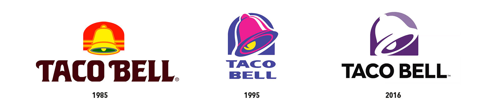
Notice the intentional hand-alignment of the stem (the main vertical) of the T and left side of the B? Learn how to optically align your typography like this in Adobe InDesign.
Mastercard Wordmark and Move to Symbol-Only Use
From ITC Avant Garde Gothic in 1979 to italics and even the addition of a drop-shadow in the 1990s, MasterCard has now returned to being set in a geometric san serif font, but this time in all lowercase in the typeface FF Mark. Pentagram completed the 2016 redesign.
The 2016 font choice is neutral with an even x-height and round letter form, emphasizing the symbol’s circles.
In 2019, Mastercard dropped the word “Mastercard” as the symbol could now stand for itself with its worldwide recognition.
Pinterest Wordmark
The original wordmark was a custom-created script logotype. More generically, the 2017 rebranded Pinterest wordmark utilized Neue Haas Grotesk Black, albeit with slight modifications.
In 2022, Pinterest commissioned a font called Pinterest Sans, which is supposed to be forward tilting and physically leaning into the future. The original script “P” remains as the symbol while it appears that, for now this new typeface is used in advertisements and has not yet replaced the logo’s wordmark from 2017.
Airbnb WordMark
The current Airbnb logo was created during a 2014 rebranded. The logo sets a lowercase Airbnb in a typeface called LL Brown, a geometric sans serif font.
GoDaddy Logo’s Font
The 1997 GoDaddy logotype used the stylized display font named Good Dog Plain, designed by Ethan Paul Dunham. In 2016, GoDaddy rebranded, and the new genericized wordmark uses Boing Bold, a rounded sans serif font. By 2020, the Go Daddy Dude was abandoned, but the simplified bold sans serif font remains.
RiteAid logo Rebranding

In 2022, the forty-year-old logo was rebranded as part of Rite Aid’s transformation. Noticeably, the company name Rite Aid has remained a legible san serif font, but the color palette and thickness of the font have changed. The company name has been pulled from within the badge (which becomes too small to remain legible on many digital devices) and is now located beside the icon badge.
From sans-serif to serif
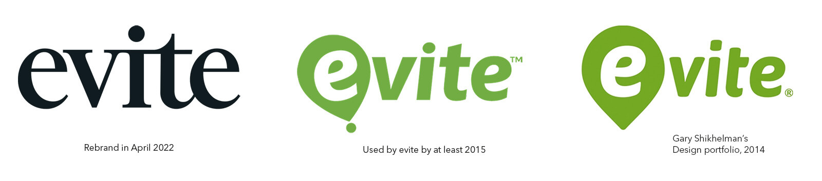
Evite.com Wordmark
Almost the exact opposite, after 23 years, evite.com went from a sans-serif generic typeface and chose to rebrand itself in 2022 with a more stylized serif typeface.
If you’re interested in branding, you may enjoy these other logo design posts.