Squarespace Web Design Tips

S

Squarespace is a website builder for personal and professional websites. This post highlights a selection of my tips and steps to help you accomplish common website functionality and design tasks on the Squarespace platform.

Please note: these tips are for Squarespace 7.1 and above.


Help Selecting Text

I’m used to selecting text in Adobe applications with a single, double, or triple mouse click. This doesn’t work in Squarespace, which can be pretty frustrating.

Here’s the tip

Use Command + A to select all your text in a text box; it’s the equivalent of a triple click in Adobe products.


Choosing WWW or Non-WWW is Easy

No need to configure an htaccess file to choose if your website uses www or is naked, instead simply toggle the chose for Use ‘www’ prefix in Domains and Emails > Other Settings.

Use or do not use www for squarespace website

Create In-Page Anchors

There are many times when you may want to link to content on the same page. You do this in web design with anchors. Links with anchors are links that include the hashtag or number sign. The hashtag in the link corresponds to an ID in your content. For instance:

For the link: example.com/#anchorname

any of these ID elements would work:
<div id="anchorname"></div>
<h2 id="anchorname"></div>
<section id="anchorname"></section>

In Squarespace, you must use the Code block to create anchors or content IDs in your pages. You can use blank <divs> or add code to customize headings or other content types with IDs.

Then you’ll use the “Link” option in your navigation and type #anchorname for the link URL.

To note, in the lowest level plan, the Personal Plan, you can create anchors in the code block; however, if you try to add a script, you will be prompted to upgrade plans.

Video for how to create internal links on a page in Squarespace (using anchors)

Hello, so today we’re in Squarespace and

I wanted to show you how you could create links on a single

page website and how you can make anchor links on

your page. So first in your pages on main navigation.

The types of additions you’re going to add when

you click the plus sign is, it’s going to be a link.

Right, so you can see each of these services, sample work, reviews and contact.

If I am to click them, they move down on the same page.

Alright so how that works is if I come in and edit my

link, you can see I pick the title and that’s what’s shown in my

navigation. But for the URL I have it open in the same page not

in a new tab. I have the anchor where the tag

and it says, “Services.” Alright, so how does it know where to

go? I’m going to use this anchor and that’s what I’m going to ID

that area of the page. So if you come down

to Services and if I come to edit, you’re

going to see that there’s actually this code block hidden.

You don’t see anything in it. If I say edit it says <div id=

“services”></div>. So the format is div id and then whatever term

makes sense for that area of the page and then that’s going to be

what happens in your link. Alright so for

this one, we’re actually going to change it and so

you can just see this in work.

I now have commercial and residential so I’m going to change

this term to residential.

Okay. And if I go back to home.

Okay, now we’re going to edit our page. And

let’s see.

It might be taking a moment to update.

But we’re going to add an additional one.

And it’s going to be called commercial.

And it’s going to have an anchor commercial.

I’m going to say save. Okay,

it’s now updated. So we have commercial, residential.

I’m going to change the order here so I can drag and drop.

Commercial comes after it. Now when I go in to edit.

I can copy.

Command C. Come in to commercial.

Select that section so Command C. It’s now pasted that piece

of code. Um,

it’s okay that it’s overlapped. I need to come in and say edit and

this time it’s going to be an ID div that’s empty and it’s going

to say commercial. Okay,

so if I say save and then I exit I

should be able to go commercial. It takes me to that area.

I come back up, residential, it goes there.

If I look at it in mobile view I’ve added it to my

menu. When I click to commercial it will open

in that area.

Another tip that you’ll want to pay attention to is that when you align

your code the way that it looks on desktop is likely different

than mobile. So in my desktop view my code is above

my title. When I click to mobile you

can see that my code is below my title.

So we really want it to be that like my code is the top

because we want it to show all of the words,

right? Umm, so just don’t forget to

take a look at what your site looks like in both

mobile and the desktop

view. So that

your umm anchors work the way you are expecting.

So let’s just make sure here.

Okay, so we have commercial and let’s see if we test

commercial. Okay,

we’ve got sample work. What do I have here?

Commercial. Okay, let’s see.

Let’s look at our code again.

Okay. Okay.

There we go. So we can see that it aligns where we want and

mobile. And also if we test in,

desktop, it’s still acting up a little bit as far as refreshing,

but it does actually work in all of them.

Alright, so that is how in Squarespace you add anchors

using IDs to add navigation on a

single page website. So hopefully that’s helpful and the script

is in the comments below this YouTube video.

Alright, good luck designing.


Add SVG images to your Squarespace Site

If you try to upload an SVG image via the Image Block, you will receive an error in Squarespace; however, there’s still a way to include crisp, vector SVGs into your Squarespace websites.

To include SVG images, instead of using the Image Block, use the Code Block and copy and paste the SVG code into the code block. Here’s a video walk through of how to add a SVG to Squarespace.

In your <svg></svg> change the size by adding or changing
height="100" width="100"
This can go right before your viewbox=""

One thing I ran into is that for one of my clients, the website highlighted two separate businesses. Each of the businesses has separate social media listings. SquareSpace includes a Social Icon block, but every place the block is used has to display the same icons and links. If you change the links or icons in one place, they’ll change everywhere. So, this meant that I needed to add some icons manually. I used Font Awesome for this.

To follow along, here’s the Facebook Font Awesome icon that I’m demonstrating with. The code to wrap your svg icon is as follows.

<a href="https://www.yourlink.com" target="_blank">
<svg></svg>
</a>

Is your Code Block too tall? There’s a CSS fix for that and a video I recorded too.


Stylize your Thank You Message on Your Contact Form

I’ve been able to stylize the <div> wrapping my form’s thank you message with the css class div.form-submission-text (7.1 Squarespace).

For instance, this code changes the background of the div wrapping my thank you text, adds padding and rounds the corners.

div.form-submission-text {
  background-color:#ede3da;
  padding:5%;
  border-radius:10px;
}

Duplicating your site – and extending the expiration date

If you’re working on a new Squarespace website, it might take you longer to create your website than the Free trial provides. When your trial expires, then your Edit mode becomes locked and you’re shown an Announcement Bar that reads, “Your trial has expired. Subscribe to continue editing your site.”
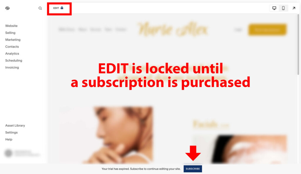
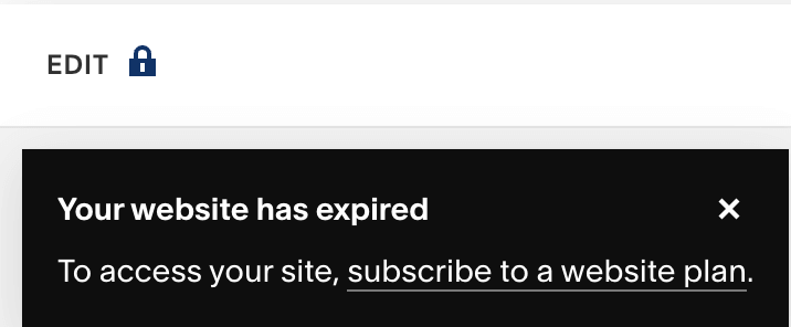
edit mode is locked in squarespace when your subscription expires
Your SquareSpace website has expired

Expired SquareSpace Site

If you need more time to be ready to Subscribe, a free work-around restarts your Trial time. From your dashboard, click the horizontal ellipse in the top right. Then select, Duplicate Website. This will create a copy of your website that is fully editable and has a renewed Free Trial countdown.

Duplicate your expired Squarespace website to reset the free trial.

Once the duplication process is complete, you can safely delete the expired site from your dashboard. To note, I’ve found that duplicated sites are at the bottom of your dashboard list, so you may need to scroll to see your new site. Also, the naming convention is the same as your original and appends (Copy) to the end. Also, don’t be alarmed if your new copy prompts you to Name your site and go through start-up modules. Your prior data is safe and available once you make it through the setup screens.

Extend Your Trial by 7 Days Automatic Email

When you first trial ends, you will likely be sent an automatic email that has a link to extend your Free Trial by 7 days.
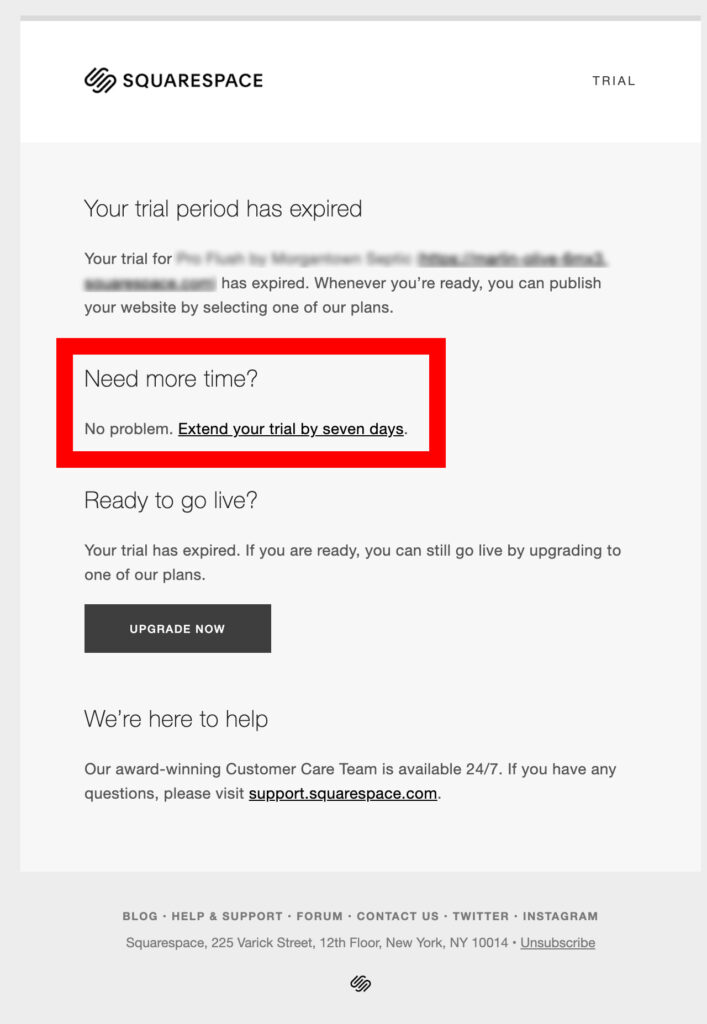
Automated email to extend your Free SquareSpace trial by seven days.

To note, if you work with a Circle Member designer, you have 6 months of a free trial.


Add a Current Copyright Year that Automatically Updates on Squarespace

To include a programmatic copyright year, I input inline Javascript into a Code block. The video below explains how I did it. Note: this is using javascript in the code block which requires a business plan or higher.

Hey Squarespace Designers!

Today I’m going to show you a way that you can use inline

JavaScript to go ahead and create a copyright with a year

that changes automatically. So this is something you’re probably used to seeing in

lots of website’s but I’m going to go ahead and show you how

I did it. Now I’m sure there’s lots of different ways to do it

so here’s just one you can evaluate. So in this

case, I have used a code block.

So in the code block when you click on it you can use the

pencil to edit and you can see I have a

class and I

found the class of what other small text is and I

will show you how to do that. But so I use that same

class and I use this snippet of code which has the copyright, the

copyright symbol, and then here’s the script that’s going to pull

the current year, then the company name and

I’ve included some links. So you can preview

in safe mode and you’ll notice that when you preview it, doesn’t actually pull

in your CSS styling but I can see what it looks like when I

click exit and I’m now previewing this work-in-progress

site and you can see I have my copyright there so your

snippet of code which I will also put in the first comment of this

video is something along these lines. Alright so

that will be there and let me just show you if you were looking

for what class you could use and- use snippet of code you can use

google inspect, come in and use your select element. Grab text that’s

similar and you can see it is the class s-q-s-r-t-e

dash small so that’s what I also copied and then used

in my scripting code. So again, this is the way you can use inline

JavaScript and your Squarespace footer to show a copyright and update it

automatically.

Here’s the code I used for the Footer Copyright in the video.

<p class="sqsrte-small">Copyright &copy; <script>now=new Date(); year=now.getFullYear(); document.write(year);</script> Pro Flush by <a href="https://morgantownseptic.com" target="_blank">Morgantown Septic Tank Service</a>. <a href="https://kellybarkhurst.com/" target="_blank">Web design</a> by Barkhurst Creative.</p> 

For just the basics, copy and paste the following inline javascript code and html, and simply change out “Company Name” with your company name.

<p>Copyright &copy; <script>now=new Date(); year=now.getFullYear(); document.write(year);</script> Company Name.</p>

Working with this SquareSpace code block brought up the issue of the Code Block being too tall and causing issues in the design. If you’re running into this issues, there is a CSS fix that you can use.

For more programmatic footer copyright scripts, check out our post, “Add A Copyright Year Programmatically To Your Website Footer.”


Button Text Size in Navigation

I was having a bit of trouble finding how to change the font size and weight of the Navigation Button. I kept getting to the Primary button settings, but changing those settings did not change the Header Navigation button look and feel, only the primary button in the form.

The solution: Go to Fonts and then select the bottom option, Assign Styles. Then select HEADER BUTTON (Custom). This allows you to adjust just the look and feel of your Header Navigation Button. In this custom mode, you can change the font weight, font family, font style, font size, font letter spacing etc for the navigation Header Button.
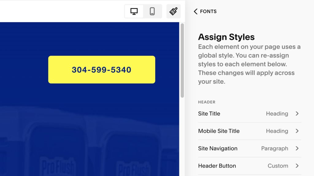
Change Squarespace header/navigation button text size.

Add Site-Wide Animations

With the check of a check-box, you can implement site-wide animations for your content. Choose from fade, scale, slide, clip and flex. For more resources on SquareSpace animations, check out the docs.
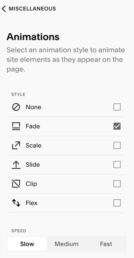
Global squarespace settings for 7.1 version and above

Overlap Navigation/Header with Hero

In one of my designs, I asked, “Is there a way to make my header and navigation overlap my hero image?”

I realize this question is highly specific to each website design, but a possible design option is to use the Gradient background color option in your navigation/header settings. This solution is especially useful when your hero image has the same solid background color as the gradient you choose for your header. This combination allows for a smooth overlapping effect. In the short video below, I demo the SquareSpace header/hero image overlapping effect in action.


Where’s my Site Map?

Your site map is automatically generated by Squarespace and exists at your domainname.com/sitemap.xml

Don’t overlook submitting your site map to Google.


How does the Portfolio component work?

The “Portfolio” feature is new to Squarespace 7.1. The Portfolio can be an active page in your navigation or be unlinked and accessed by direct links.

Can my portfolio page be set as my homepage?

Yes, the Squarespace Portfolio can also be designated as your home page. When the portfolio is your homepage, the assigned Portfolio slug will be ignored and redirected to your homepage, such as www.example.com; however, that slug is used as the first directory for all your projects. For instance in the following, the portfolio slug is set as “gallery” or “portfolio” — gallery/maternity-images or portfolio/home-decor.

How can I use the Drop Down menu with the Portfolio option?

You can create a Drop Down in Squarespace and add links for each section of your Portfolio. This way, your portfolio’s projects can be seen and accessed from your navigation.

Notes: when you add links pointing to the projects in your portfolio, make sure that if you are using relative links that you add a forward slash in the beginning of your slug. For example, the link your would save would be: /portfolio/home-decor. This will allow your link to be a relative URL. Otherwise, include your entire url starting with https://www.example.com as the link.

SquareSpace Custom Type: Portfolio Overview Video for Making Portfolio on the HomePage and Making Links

Hey Squarespace builders,

this video is to talk a little bit about how the portfolio works

and in this example you can see I’m looking at the navigation and

there’s different icons. When you see this grid of four,

that means it’s a portfolio video and what I want to show you is

in your navigation you can click on the settings for a section.

And for your portfolio settings it will say portfolio on the left

and you can choose what it’s called in your navigation.

So I’ve called it home so that’s how. Okay. All right. So you can

make a portfolio page or home page and you can add sections to it

just like you would any regular page. So this is where it gets a

little bit confusing. At the bottom of

my general settings you can see this is set as your home page.

And so it gives me a little home icon meaning it’s the

home page. Which means whatever domain name I’ve associated with

this Squarespace site. So let’s say this is birdofkaradise.com.

that will go to what is the home page.

But also, whatever’s- It’s a because you’re required to add a slug.

This slug will redirect to the home page without

the slug, right? So it will go to birdofkaridise.com.

So it is not a duplicate, it is a redirect.

Alright, so why setting the slug is important,

still, if your home page is your portfolio,

is when you, let’s say in this case,

this is the view of the portfolio, so each word brings up the

feature image. So if I click on jewelry,

I’m now in a sub page of the portfolio.

And it has a URL. So if I come in to edit,

it is a project,

it gives me all the blocks that I can update here on the page,

but it is in portfolio,

which gives me the piece left and right navigation

that takes me to other areas of the

portfolio. And you can actually see when I hover over this that

the URL slug is portfolio/fiber-art and

over here it’s portfolio/home-decor.

And that’s why it’s important that I had that slug portfolio.

If you had typed in something like home, then you would have /home/

jewelry or home/home-decor.

course, so realizing that you want it to be a term like gallery or

home. So in my design,

so the home page is going to have the starting

point, the kind of grid view of the portfolio.

And you can get to all of the sub pages by clicking when

that is there. But I also wanted a way that someone could get quick

links to each of those areas, almost like their own pages.

So how I did that is I created drop down links.

And what’s important about this is when

you create, so you would go to the plus sign, and you have this

option for drop down. Alright,

so this first item, it’s not actually a link.

I cannot get to the page “My work.”

It is only used to be able to open whatever the

drop downs are. Now,

it’s a little bit confusing here because if you click the settings,

you do have have to have a URL slug and it does have

to be unique. However, it does not go anywhere.

It’s kind of ignored.

Alright, so then I’m using links rather than pages.

I cannot actually access the components of the portfolio.

So when I click add page, I’m going to choose link.

And then I can call it what I would like.

So in this case, if I go back to home,

I can actually see the links that I am creating.

So I have fiber art, jewelry. You can always

drag your navigation to change the

order. So after home decor,

I have apparel. So I’m going to go to add page link.

I’m going to call it Apparel. And I know that the URL

is I’m using a relative URL here meaning I need to start with a

forward slash, and it’s a / portfolio,

and then apparel.

And to show you again, you can tell what your URL

is even by just hovering over,

you can see on the bottom left of my screen, I can see

/portfolio, forward slash statement,

hyphen walls. So that’s what I’m going to add there.

Go to links. Statement walls.

Again, forward slash starts it, so I am relative link.

If you do not do that, then it will try to link you

to portfolio slash statement walls instead of whatever your domain

name is. So you’ll get an error, your domain name would be in this

case, birdofkaradise.com/portfolio.

Uh so you do want to make sure that your cognizant of umm.

A relative URL, or not.

Okay, so we’ve added a few of those and you can see I can

continue to add it. And if we go ahead and

click into a page,

you can see what we are doing.

So we’ve used a portfolio as our home page.

That way we can add whatever we want,

but it also has that portfolio element.

And then we’ve created the navigation for those pages that are

housed from the portfolio by using a link tree.

Here making links through

drop downs directly to those pages that are living within portfolio.

Umm so hopefully that helps. Alternatively,

if you do not use portfolio,

you would kind of create your own each of the areas in

your portfolio would be their own unique pages and you would use

a drop down to get to them and you would maybe use a gallery

to kind of have the way to group them.

But the portfolio component is a new component that

has a lot of possibilities and is available

to you in the latest Squarespace.

Alright, Enjoy!

There’s a few other things I wanted to show you as far as portfolios

and slugs. So here’s the portfolio and I’ve named it home.

If we click on the actual portfolio in our pages,

that’s where it gives us,

it’s kind of the double click in. And these are all of the areas

of your portfolio. And you can add more by

saying plus and add a project into your

portfolio or your gallery.

You can also use the horizontal ellipse,

go to settings, and, and you can duplicate one that you’ve already made.

Now note that there is no way currently to

hide one of your projects or your areas.

So as soon as you create it, it’s live on your website.

So that’s the bad part.

Note that when you come in to the horizontal ellipse,

you can change your featured image. And in this case,

those featured images are typically what’s going to be shown and however your

work is presented as the portfolio.

So in this case, you can see this is what’s shown

as the background image as I roll over all of these categories.

Alright, so as we’re talking about slugs,

in this case, I’ve made my portfolio,

that page is my home page.

And so I can access that from the root of my domain name.

So in this case, that’s the birdofkaradise.com.

And if I click on the settings, this is where I can make my

URL slug. So my URL slug,

when it’s the Home, is pretty much ignored,

but it is used for the sub pages.

So how you see those, is if you click on your portfolio,

then you’re seeing each of your elements, and then that’s where you’re going to

go. I’m going to go to the horizontal ellipse,

and you are going to set the second part of the

slug, the second line, the second area in,

but the first part is from whatever you’ve named your portfolio.

So you probably don’t want it to be home or something like that.

You want it to be more like “Gallery,”

or “My work,” or “Portfolio.”

So you want to make sure that you name

your URL slug of the portfolio,

something that is going to be useful,

and you want to be for all of your sub pages.

So in this case, once I’ve changed that and I come back into the

ellipse, you can see it’s now portfolio/ fiber-art.

And this is the slug, although you can’t grab both.

But this full relative address is what we’re using

when we go into our drop down menu and I’m

directing people to home decor. You can see that that.

That link is portfolio/home-decor.

Umm and all the other ones are portfolio slash apparel,

portfolio/bridal.

So that’s how it kind of works.

And so that’s what you want to make sure that you’re paying attention to

is you’re setting your slug from where you’re going where you’ve defined your portfolio

home, but you can’t actually just get to that portfolio

page. It will redirect to your home page.

Alright so again I hope that demo helps you better understand how the portfolio

component is working in Squarespace.

Additional Squarespace Portfolio resources:


Are there gotchas?

Yes, of course, like you can’t upload a webp image. Annoying!

Adding Javascript Requires a Business Subscription

As a web developer, one of the gotcha’s that was quite frustrating is that you can not add custom CSS or Javascript unless the site you’re working on has a Business or higher subscription ($23+ a month); the personal plan does not allow for custom CSS and Javascript. Custom code is accessed via: Home > Settings > Advanced > Code Injection

Auto-generated JSON Schema doesn’t validate (still in 2024)

The Business Plan automatically creates @organization schema for you and places it on your page automatically. You can not edit this auto generated JSON schema AND frustratingly, the auto-generated schema does not validate. There is no good way to get it to validate. Some options are to delete your business content from Squarespace, but that means that the mobile menu bar would no longer work and your theme might use that content as it’s your business hours, business name, business email and business phone number. You’ll just have to ignore this incomplete and unvalidated schema and instead create your own schema that you add via the Code Injection.

Add title to images with links in the Editor

Also, I could not find a way to add a Title to an <a href> link tag so that text appears above a link (as shown below).


Don’t miss these branding opportunities

Adding a Social Sharing – OG Image to your SquareSpace Site

The social share image is shown when your website is shared by text or linked to on social media sites such as Facebook, LinkedIn, and Twitter. This is your opportunity to share your brand or important ways to reach you, such as your website URL or phone number.

On SquareSpace, go to Settings > Website > Social Share. Add your image and then click Save. A recommended pixel size for your social share or og:image (open graph image) is 1200px by 630 px.
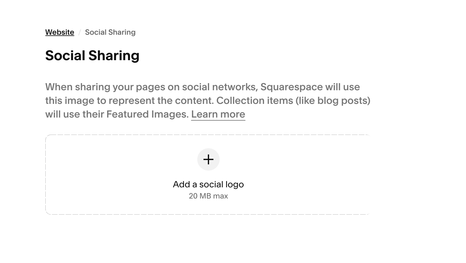
go to Settings > Website > Social Sharing to upload a social sharing image on Squarespace

Adding a Favicon

Another opportunity to brand your website is adding a Favicon to your Squarespace site. To do so, go to Settings > Website > Favicon. Add your default image and optional dark mode image, then click Save. Learn about Favicons in our article, What is a favicon, and how do I create a favicon?”
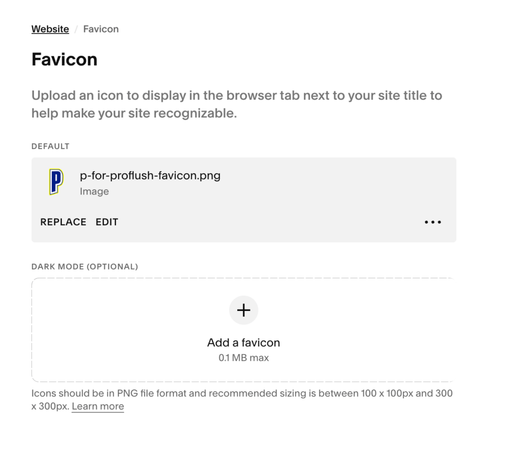
Add a favicon to Squarespace. Includes options for regular and dark mode.

Happy Web Designing!

About the author

Kelly Barkhurst

Designer to Fullstack is my place to geek out and share tech solutions from my day-to-day as a graphic designer, programmer, and business owner (portfolio). I also write on Arts and Bricks, a parenting blog and decal shop that embraces my family’s love of Art and LEGO bricks!

Add comment

Recent Posts

Archives

Categories