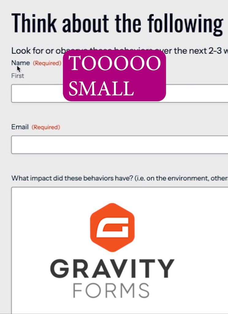
If you’ve ever looked at a Gravity Form on your WordPress site and thought, “My font size is too small,” you’re not alone.
When you look online or read older documentation, the standard advice is to copy long lists of CSS selectors and slap !important on your declarations. But if your site uses Gravity Forms’ modern Orbital theme, those old snippets won’t work.
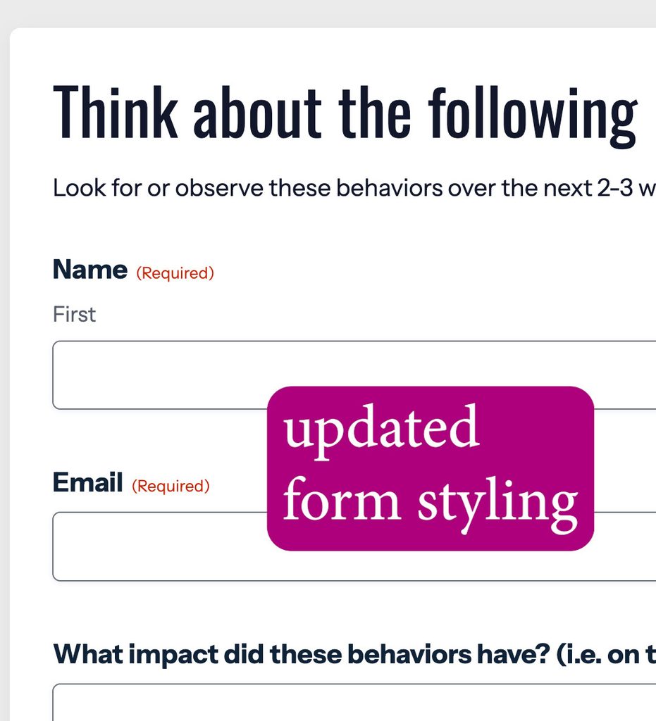
Instead of fighting legacy CSS, you can use CSS Custom Properties (Variables) to cleanly customize your forms without using !important. Here is step-by-step how to do it.
Watch Video: Change Size of Font on Form
Step 1: Why the Old CSS Methods Fail
The traditional approach relied on heavy selector targeting and forced overrides:
/* Legacy Gravity Forms Method (Not Recommended for Orbital) */
.gform_wrapper input[type=text],
.gform_wrapper textarea {
    font-size: 18px !important; /* Requiring !important */
}
If you paste this into your site and flush your cache, you might notice nothing changes. That is because the newer Orbital theme relies on CSS custom variables rather than fixed rule overrides.
Step 2: Modern Font Styling with CSS Variables
By targeting the root wrapper via html:has() or body:has(), you can update font size and design variables cleanly:
/* ==========================================================================
   INTERNAL FRAMEWORK VARIABLES (Sizing & Typography Tokens)
   ========================================================================== */
html:has(#gravity_forms_theme_framework-css) .gform-theme--framework.gform-theme--orbital {
  /* Fonts & Typography Scales */
  --gf-font-size-secondary: 18px;            /* Base scale for secondary labels & fields */
  --gf-font-size-tertiary: 16px;             /* Sub-labels text (e.g., 'First'/'Last') */

  /* Field Row Spacing */
  --gf-form-gap-y-md: 28px;
  --gf-form-gap-y-lg: 32px;

  /* Form Field Inputs */
  --gf-ctrl-size: 52px;                      /* Height of standard input rows */
  --gf-radius: 6px;                          /* Input fields corner smoothness */
  --gf-ctrl-border-color: #686e77;           /* Input line visibility color */

  /* Form Selections */
  --gf-ctrl-choice-size: 20px;               /* Enlarges checkbox squares and radio circles */
}
/* ==========================================================================
STRUCTURAL LAYOUTS, LABELS, BACKGROUNDS, & RESPONSIVE GAPS
========================================================================== */
/* Question label style */
.gform-theme--foundation .gform-field-label__text {
font-weight: 700;
font-size: 20px !important; /* Bumps up the text size slightly alongside the bold style */
}
/* Mobile View Setup */
.gform-theme--framework {
background-color: #ffffff !important; /* Adds white background */
border-radius: 8px !important; /* Adds rounded corners */
padding: 24px !important; /* Snug padding for mobile screens */
box-shadow: 0 4px 15px rgba(0,0,0,0.05); /* Optional: Soft shadow to pop off the page background */
}
.gform-theme--framework .gform_heading {
margin-bottom: 1.5rem !important; /* Smaller gap on mobile screens */
}
/* Desktop View Adjustments (768px and up) */
@media (min-width: 768px) {
.gform-theme--framework {
padding: 32px !important; /* Generous padding for desktop screens */
}
.gform-theme--framework .gform_heading {
margin-bottom: 2rem !important; /* Full 2rem gap on desktop */
}
}Why this works better
- No
!importantflags needed: Cleaner and maintainable CSS architecture. - Full theme control: Easily tweak gaps, borders, input heights, and font weights alongside text size.
Where to Add This Code in WordPress
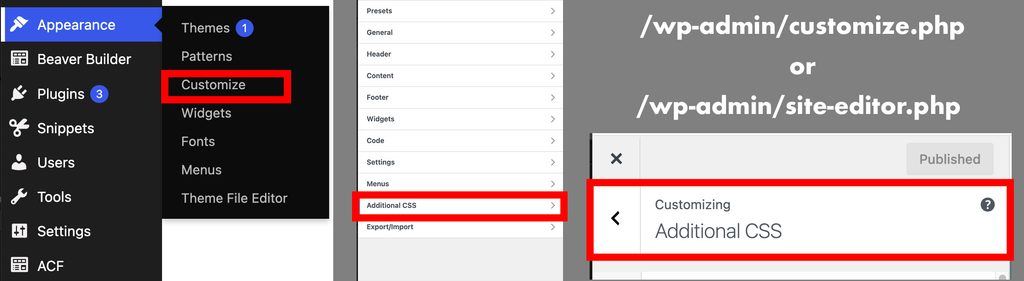
WordPress websites can be crafted in many, many different ways, so find your custom CSS area. For instance, here’s one place it might be accessible:
- Log in to your WordPress dashboard.
- Go to Appearance > Customize.
- Click on Additional CSS.
- Paste the snippet above into the editor.
- Click Publish.
- Clear/flush your site cache to see the changes update live.