What is the definition of kerning?
Kerning is a typographic term that refers to the space between individual characters in a word. Described another way, kerning is the space between each letter in a comment. Characters and letters are synonyms in this definition.
The goal of kerning is readability, legibility, and beauty. Kerning values are often different between each letter meaning kerning is not uniform across words, sentences, or lines of text. Kerning is a technique designers use for fine-tuning the display of text, letter by letter.
When should I kern my type?
There are many situations when you should spend the time to adjust your typography’s kerning manually. These cases include:
- When the text in question is part of a logo
- When the text is set in all capital letters
- When you’re working with a large headline
Is there font-kerning on the web?
Yes, there is a font-kerning CSS property. According to MDN Web Docs, the font-kerning property utilizes the kerning information stored in a font. The default value is auto, allowing the browser to decide if kerning is used or not. Normal forces the font’s embedded kerning information and none disables the font’s embedded kerning information.
font-kerning: auto;
font-kerning: normal;
font-kerning: none;
Practice your kerning skills with this game
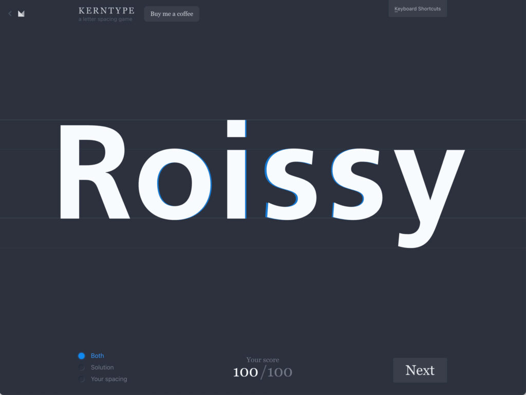
Are you wondering if you have a discerning kerning eye? Play Mark MacKay’s Kerntype game! Warning: This game is addicting!
If you liked this game, you’ll love our roundup of the Best Typography Games.
Thinking about the beauty and functionality of kerning…
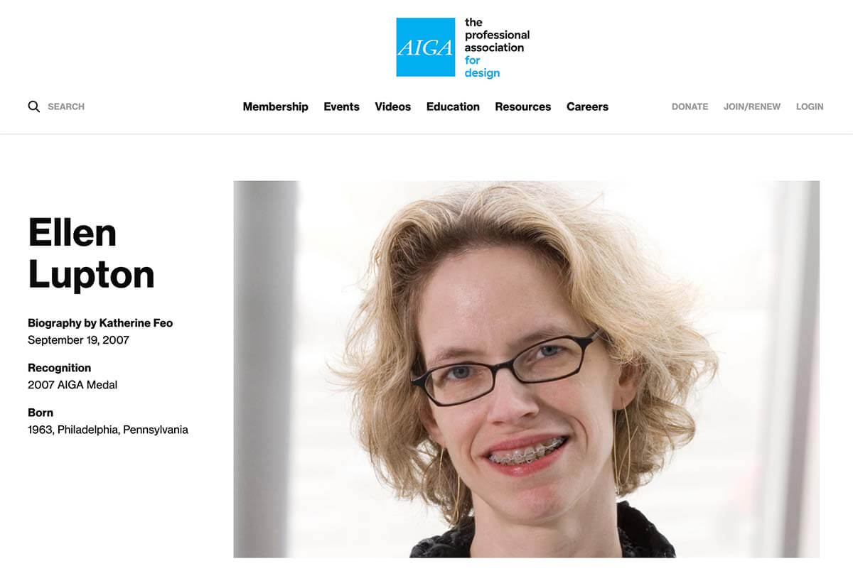
Several years ago, Ellen Lupton spoke as a visiting artist at the College of Creative Arts at West Virginia University. I had the privilege of attending Ellen Lupton’s lecture and sharing a fabulous after-lecture meal and conversation. (If you didn’t know, Ellen Lupton is an award-winning graphic designer, educator, and author.)
An image I’ve never forgotten from Lupton’s presentation is a photograph of her smiling with braces. Lupton grinned when she shared her selfie and talked about her braces essentially “kerning” her teeth placement. This real-life “kerning” visualization and thought process clicked for me. After all, as a fellow “tooth kerner” and graphic designer, I can relate!