

The Designer’s Guide to Variable Fonts in InDesign: Stop Missing Font Warnings for Good
One of the clients I often design for has several variable fonts as part of their brand. As variable fonts are fairly new, there are some gotchas I’ve run into in InDesign that I’m sharing here.
So, what’s the deal with Variable Fonts?
On paper, they sound like pure magic. Instead of cluttering your system with twenty individual files for Light, Medium, Bold, and Heavy, you install just one file that gives you fluid control over weight, width, and optical size using simple sliders.
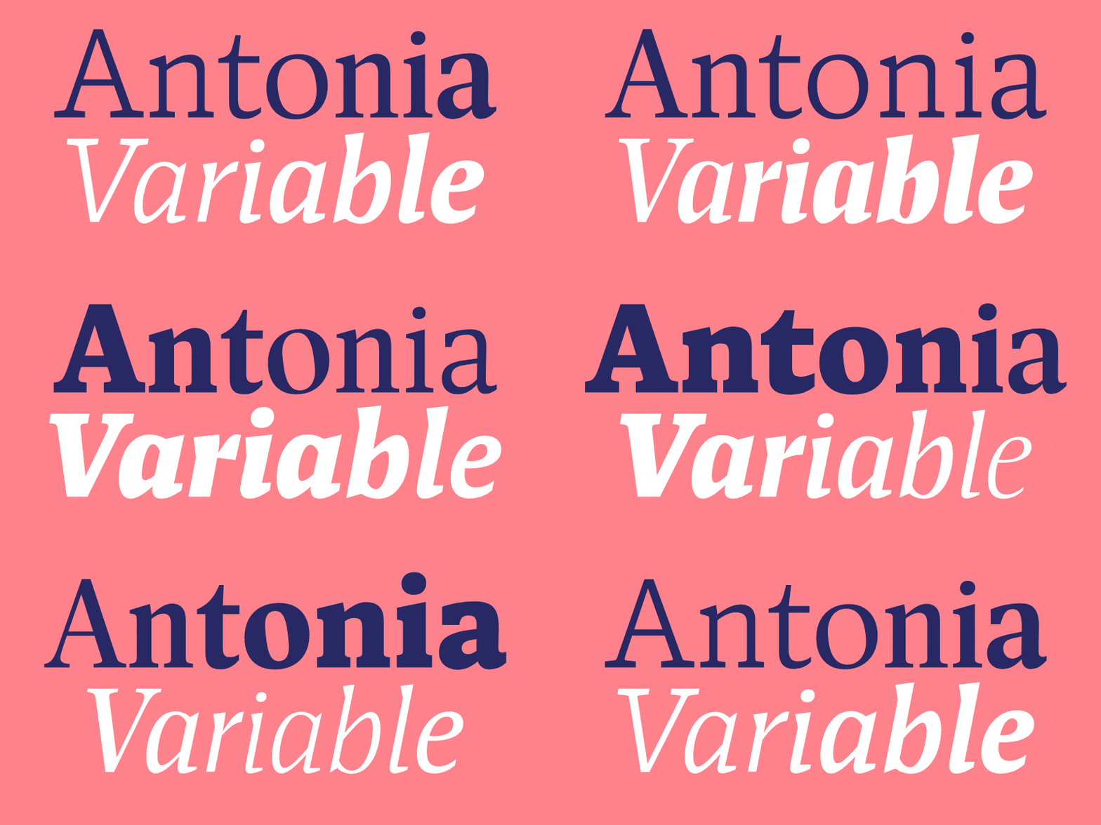
Think of a traditional font like a standard light switch. Your text is either Regular or Bold, on or off. A variable font acts more like a dimmer switch. You get a continuous spectrum, meaning you can tweak a font’s weight to something hyper-specific like 615 or 690 if standard Bold feels just a tiny bit too heavy for your column layout.
That flexibility is incredible, but in practice inside InDesign, it can quickly turn into a production nightmare.
My Initial Struggle with Variable Fonts
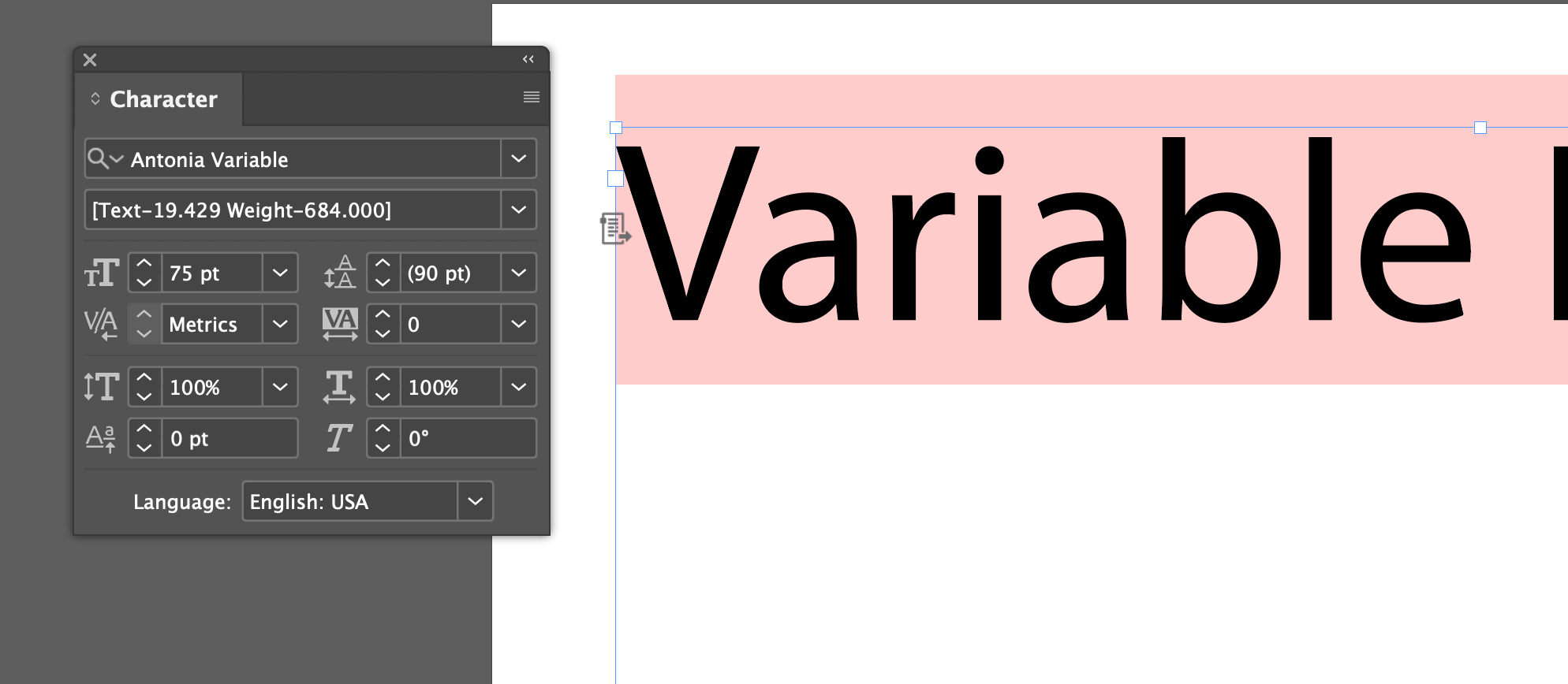
My biggest struggle early on was figuring out what I was looking at. When you open your character settings, you are not just choosing among Regular, Italic, and Bold (even though you think you’ve installed just one or two fonts). You are staring at web-like labels such as H1, H2, H3, and Text paired with numerical weight coordinates.
It turns out those H1 and H2 tags are intended as a designer’s way of categorizing optical sizes by visual hierarchy. H1 is configured for large page titles, H2 and H3 work for subheads, and Text is optimized for small body copy. But when you mix those labels with custom weight numbers, you end up asking yourself, “Wait, what style is H3 690 weight actually supposed to be?” (Spoiler: it is an H3 subhead set to Bold). And, just to be clear, this doesn’t help you make semantically correct PDFs in InDesign, meaning just because you choose H1 Antonia Variable doesn’t mean you’ve added an H1 to your content <h1></h1>,
The Errors Began
The real chaos began in my everyday workflow when I started scaling charts that used variable fonts.
Like most designers, I would group a chart along with its text labels and drag the corner handles while holding Shift + Command (on Mac) to scale the whole block down to fit the page. What I did not realize was that InDesign has a default setting that automatically pairs optical size to font size. So when I shrank my charts, the text inside did not just scale down to a clean 11pt. They instead scaled to decimal points, such as 11.451pt.
InDesign took that strange decimal point size, calculated a custom optical size axis to match it, and baked that calculation directly into the text frame as a hardcoded font name.
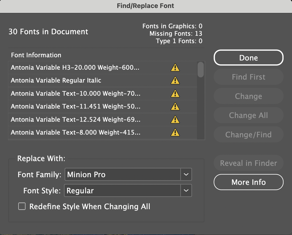
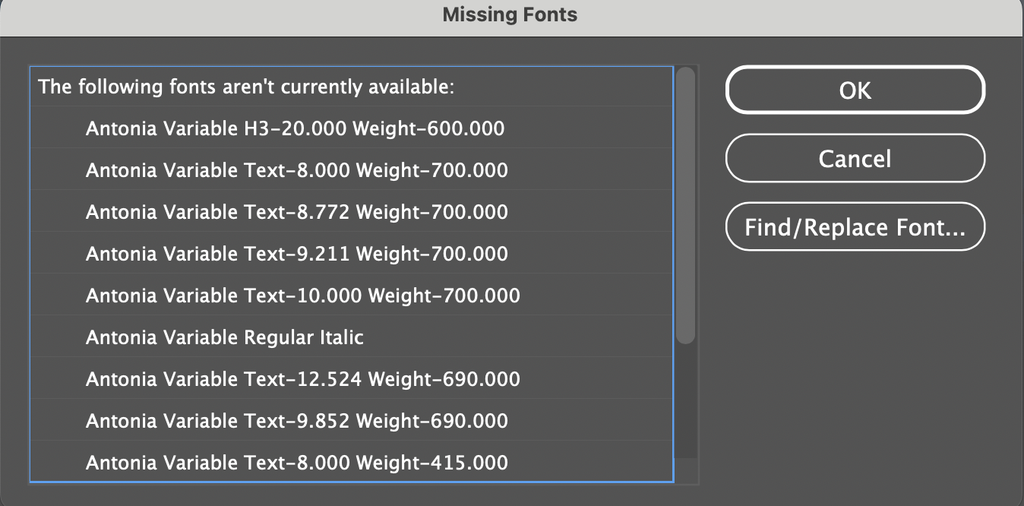
Everything looked completely fine on my screen. But the second I went to export the file for production, InDesign freaked out. The export panel popped up with a wall of missing font warnings for strange names like Antonia Variable Text-11.451 Weight-690.000. Because my computer did not have a unique font file installed for every random decimal point on the planet, InDesign treated them as missing files and threatened to replace most of my document with pink highlights. And I was supposed to only have two font files for Antonia Variable installed, and my errors were listing dozens of missing fonts!
To make matters worse, whenever I tried to fix it by tweaking the slider, the text instantly highlighted bright pink and broke its font connection.
After a lot of troubleshooting, I got InDesign working, and I’m not 100% sure this was the problem, but I may have had duplicate font files installed. Perhaps even Variable variations and non-variable variations.
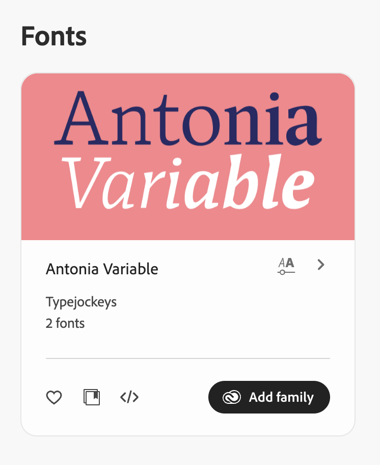
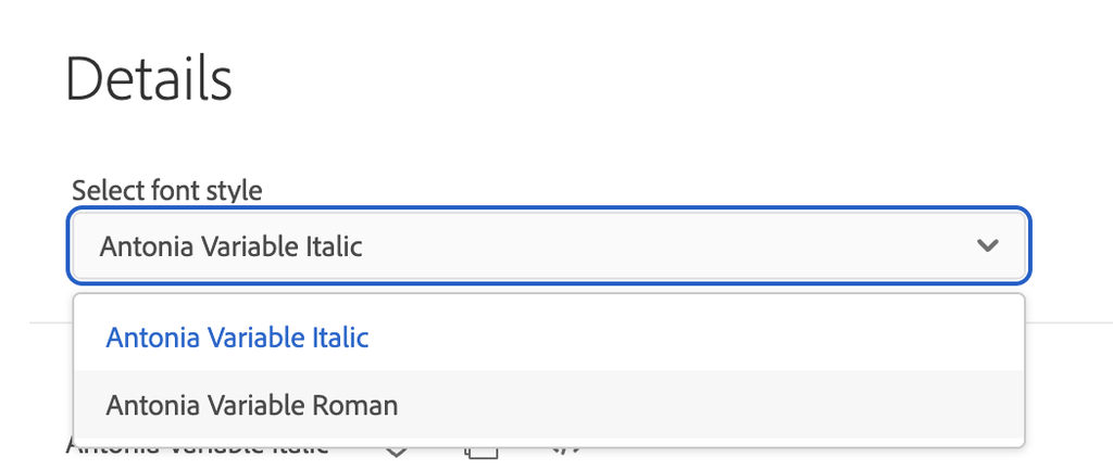
If you’re running into a similar issue, I recommend going to Adobe Fonts, uninstalling the problematic font, and then re-adding the family. In my case, Antonia Variable had two fonts to install: Antonia Variable Roman and Italic. My advice: also check your local installations and definitely delete or turn off any duplicate font files that might be static weights of your problematic font.
Whatever initially caused it, the result was that InDesign got completely confused. Whenever I selected a style like “Text Medium” and moved a slider, InDesign likely tried to route those slider changes through a static font file on my system. Since static files cannot handle variable axes, the connection instantly snapped. You can see what I mean in this video. Some of the selections were working, and some were breaking, like Antonia Variable’s style Text Medium and Text Bold (showing the pink highlighting indicating the lost connection).
Once I deactivated Antonia Variable in Adobe Fonts and then reactivated the two master variable font files, everything clicked into place. Now, when I select a preset style and move a slider, InDesign smoothly switches the style dropdown to Custom instead of breaking into pink errors.
The Takeaway
If you are diving into variable fonts in InDesign, here is the quick checklist to save yourself hours of headache:
1. Clean up your font library. Make sure you only have the actual variable font master files installed. Deactivate or delete all static weights from Adobe Fonts or your system font manager so InDesign does not get confused.
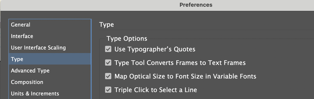
2. Turn off automatic optical size mapping. Go to InDesign > Preferences > Type and uncheck “Map Optical Size to Font Size in Variable Fonts.” This prevents InDesign from creating sneaky decimal-point sizes whenever you scale a graphic or chart frame.
3. Translate preflight numbers. If you inherit a file with missing variable font strings, decode the numbers: 500 weight is Medium, 600 is SemiBold, and 690 or 700 is Bold. Use Find/Replace Font to map them back to clean presets, and you are good to go.
Variable fonts are a total game-changer for copyfitting and layout precision. Once you clean out the static duplicate files and turn off automatic frame scaling overrides, you can actually enjoy the magic without the export panic!


