Recreate a Professional Book Cover in Photoshop Using Color Theory
Learn how to apply complementary colors to photos in Photoshop to create high-contrast, professional covers. Follow along with this step-by-step tutorial inspired by a bestselling book cover to turn standard photography into intentional, high-impact design.
Watch Video
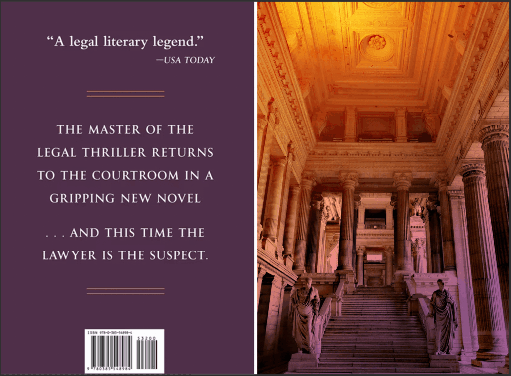
Have you ever looked at a book cover and wondered how the designer made it look so striking? Last summer I was reading John Grisham’s novel, The Widow, and I realized the cover perfectly utilizes complementary colors. The design features a courtroom interior that transitions from gold, orange, and yellow shades in the top left all the way down to purple and violet. I loved it so much that I decided we should become copycat designers and recreate it.
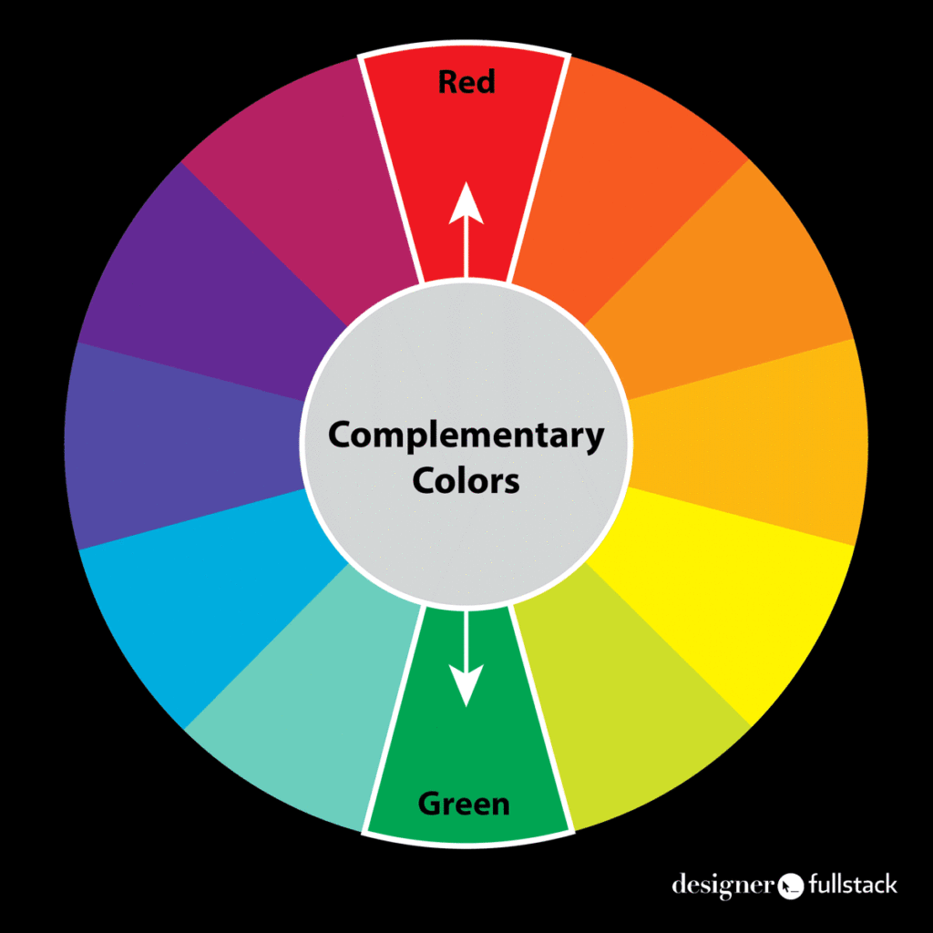
Before we dive into Photoshop, let’s talk a little bit about color theory. In a scientific color palette, the color exactly opposite your chosen color on the color wheel is its complementary color. This means every single color has exactly one complementary color. If you want to learn how to build your color wheel, check out my tutorial on how to create a scientific color wheel in Illustrator.
Color theory can get really complicated. However, we can use basic theory to determine that the highest-contrast complement for violet and purple shades will be yellow, gold, or yellow-orange. Applying this to photos in Photoshop makes them pop and stand out in our designs. It also gives us a solid color that creates strong contrast against our images, just like The Widow‘s back cover utilizes.

Tutorial Instructions
Let’s get started with our design! Here’s what your finished tutorial will look like. Start by downloading the “john-grisham-book-cover-start.jpg” and opening it in Photoshop.
Step 1: Find your image.
We are going to find an interior law image on Pexels, since it provides free-to-use photos for student work. Search for “Courthouse Interior Brussels” and download the JPEG. This specific image (a Pexels image of a Brussels courthouse) works perfectly with minimal adjustment because the marble and stone interiors are mostly light gray and white. When you’re applying this same technique to future projects, you might need to desaturate a very colorful image first or convert it to black and white.
Step 2: Prepare your Photoshop workspace.
Open your JPEG in Photoshop. It will open as a locked background layer; unlock it with your Move tool. Make sure you have “Auto-Select” and “Show Transform Controls” checked at the top of your screen.

Did your JPEG open in Mac Preview or PC Photos? As a designer or design student, that can be very annoying. You can configure your computer to automatically open images in Photoshop. Here’s a video showing you how.
Step 3: Move and scale.
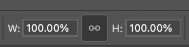
Click and drag the image into your working artboard. Zoom out using Command Subtract on a Mac until you can see the transform controls. Always transform your image from a corner rather than a side. Make sure the chain link icon is active so you do not stretch the image, and scale it down to fit perfectly into your space.
Step 4: Create a mask.
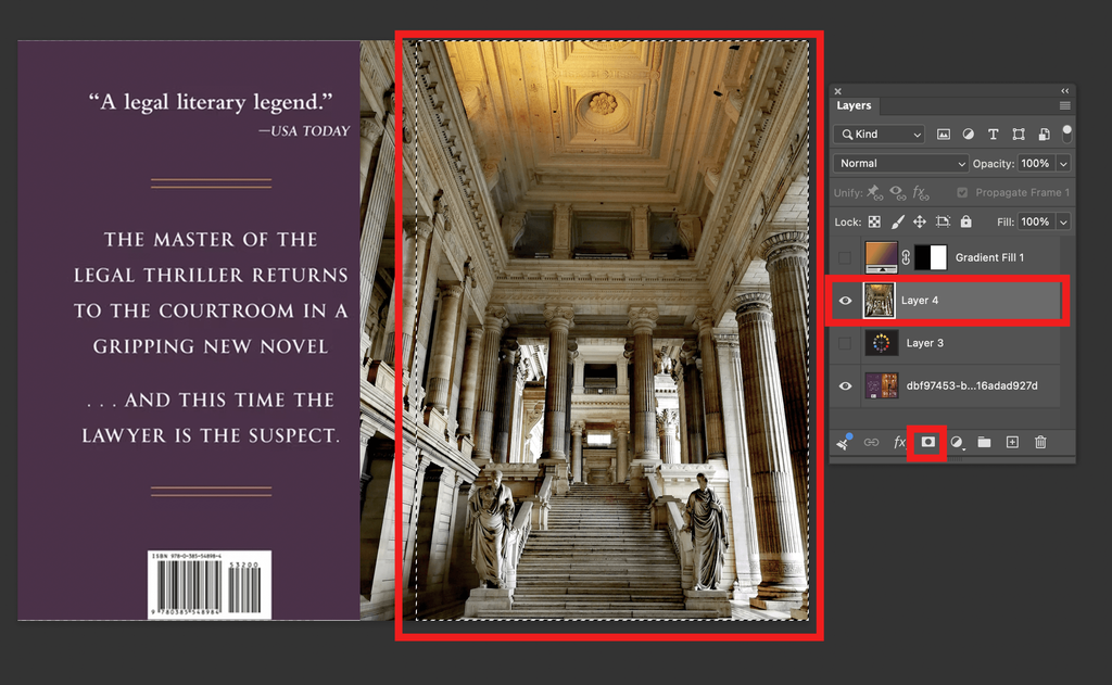
Use the Rectangle Marquee tool to draw a selection just around the front cover area. Start outside the artboard at the very top left and drag all the way to the bottom right. With your marching ants active and your image layer selected, click the Mask button. Remember, Command + D on a Mac deselects or turns off marching ants; however, when a mask is made, the marching ants automatically turn off.
Step 5: Pick your colors.
Grab the Eyedropper tool and ensure it is set to “All Layers” at the top. Pick a bright gold for your foreground color and a purple from the background for your background color.

Step 6: Apply the gradient.
Select the Gradient tool. Choose the “Basics” folder from the dropdown and select the foreground to background option. Make sure you are using a Linear gradient. Draw a line from the top left corner down to the right corner where your picture sits.
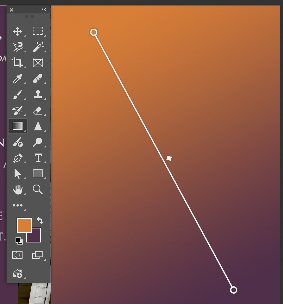
Step 7: Duplicate the mask.
We only want the gradient on the front cover. Hold down the Option key on your Mac, click the layer mask thumbnail on your image layer, and drag it up to your gradient layer. Click “Yes” when it asks to replace the layer mask. This applies the gradient to the front cover area, just like in the courtroom image. When it’s working, your mouse will show a small dotted square below the cursor, indicating it’s ready to duplicate the mask.
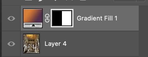
Step 8: Blend it.
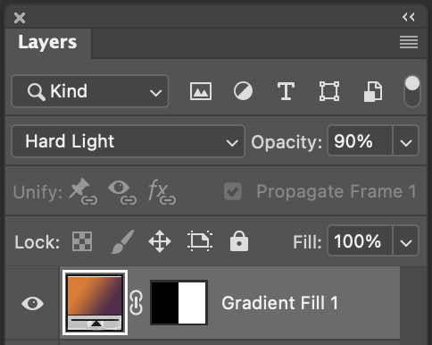
Finally, with your gradient layer selected or active in your Layers Window, change the color mode dropdown from Normal to Hard Light. You can also adjust the opacity to soften the effect.
And that is how you do it! This is a great way to use a subtle touch of color theory to make standard photography feel intentional and beautifully designed.
If you found this helpful, I encourage you to join our group on YouTube and subscribe for more tutorials. We cover all kinds of Adobe programs, coding, and ways to integrate design thinking into web design and marketing.
By the way, what brought you joy today? For me, it was waking up to see that my husband washed a whole pile of dishes. See you in the next tutorial!