

Pulling it all together into a website
In our last lesson, we explored form and space in the print world using Adobe InDesign. Today, we are bridging the gap between graphic design and web development by looking at how industry-standard design tools like Photoshop and Illustrator prepare assets for the web. While web design introduces movement, interaction, and dynamic screen sizes, the core principles of asset management remain remarkably similar to those in print.
Watch This Video
In this video, we build on our InDesign print lesson by exploring how designers prepare assets for the web using Photoshop and Illustrator. You will see step by step how relative file paths keep your HTML code connected to your project folder, how to extract isolated graphics using Photoshop selections and non-destructive layer masks, and how to export transparent PNGs with custom sticker effects. We also dive into vector cleanup in Illustrator to create custom SVG mouse cursors, examine how CSS overlays interact in real time with raw photographs, and look at how dynamic web layouts respond to different screen sizes compared to fixed print designs.
Follow Along
You’ll need the following resources and files to follow along with the video tutorial.
- Zip File of index.html and default assets folder. If you’re on a PC, don’t forget to “Extract All Assets” before starting to work. On a Mac, simply double-click the zip file to open the folder.
- Link for updated mouse cursor – switching to Hot Sauce bottle: https://www.vecteezy.com/vector-art/28660359-illustration-vector-of-chili-sauce-in-flat-design
- Background Image from Pexels: https://www.pexels.com/photo/cozy-asian-restaurant-interior-with-warm-lighting-33357444/
- Noodles: https://www.pexels.com/photo/delicious-ramen-bowl-with-egg-and-narutomaki-31393444/
1. Relative File Paths: InDesign vs. HTML
When working in InDesign, your .indd project file links directly to a folder containing high-resolution images. Web development functions the same way:
- HTML Structure: An
index.htmldocument acts as your layout file, pointing directly to relative file paths inside a folder, for example, anassets/folder. - Strict Naming Rules: Code requires an exact match. Naming a file
Noodles.pngwhen your HTML referencesnoodles.pngcan break the image link. - Asset Types: Just as print layout software pulls in vectors and rasters, web files pull in vectors and rasters and CSS for styling, JavaScript for logic and movement, and more.
Key Rule: Web servers are case sensitive! Always double check your asset folder names, spacing, and capitalization.
2. Photoshop Asset Workflow: Sticker Effects & Layer Masks
To build a floating sticker effect for our foreground hero graphic, we need to extract the subject non-destructively using this delicious ramen bowl photo from Pexels.
Step-by-Step Asset Isolation:
- Unlock & Duplicate: Never edit your raw background image directly. Duplicate your base layer and convert it to a Smart Object to preserve original pixel data.
- AI Selection: Use Select > Subject to create your marching ants selection around the bowl.
- Layer Masking: Click the Layer Mask icon at the bottom of your layers panel to mask the subject non-destructively. Remember that a grey-and-white checkered grid in the background indicates transparency.
- Inverting Masks: If your selection ever comes in backward, select the thumbnail of the layer mask and press
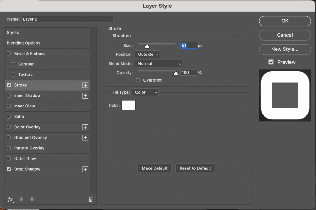
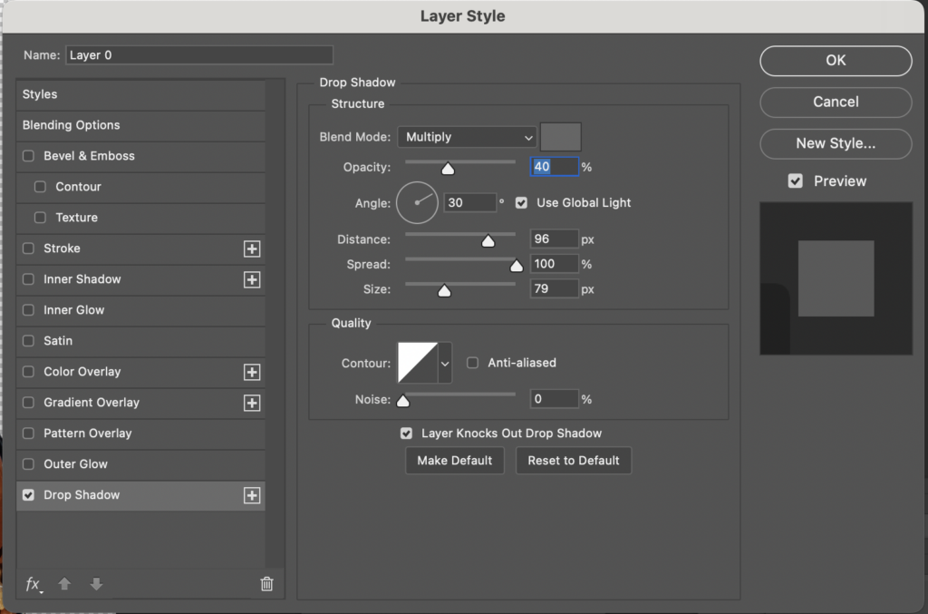
Cmd + Ion Mac orCtrl + Ion PC to invert the mask (switching white to black and black to white). - Layer Styles (Stroke & Drop Shadow): A stylized sticker effect on your image can be created by double-clicking the layer on the right to open the Layer Style panel. Add a white Stroke set to Outside (51px) and a Drop Shadow set to Multiply opacity 40%, angle 30 degrees, distance 96px, spread 100%, and size 79px.
- Web Export: Save your master working file as a
.PSD, then go to File > Export As to export a transparent PNG directly into your localassets/folder. Remember to save as a PNG because PNGs allow for transparency, whereas every pixel in a JPG must be assigned a color.
3. Code vs. Canvas: Manipulating Assets with CSS
In traditional print workflows, visual filters, color grades, and gradients are manually flattened in Photoshop before import into InDesign. On the web, graphic assets interact directly with live code. For our background asset, we are using this cozy Asian restaurant photo from Pexels.
- Lightweight Assets: Save clean, unedited base photographs directly into your
assets/folder asbackground.jpg. - CSS Manipulation: Using properties like linear gradient and mix blend mode color burn, web code applies dynamic color overlays over the background graphic right in the browser. No adding filters and effects in Photoshop required.
- Design Flexibility: This separation keeps file sizes small and lets you adjust colors or themes without re-exporting images from Photoshop.
4. Prepping Vector Graphics in Illustrator
Custom cursors and background shapes often originate as vector graphics. For this lesson, we are swapping out our default cursor for this hot sauce bottle vector graphic from Vecteezy.
What you’ll learn and complete in this tutorial:
- Isolate Objects: Open the vector EPS package in Illustrator, expand your Layers Panel, target unwanted background boxes or drop shadows using the target circle, and delete them.
- SVG Format: Unlike print, which relies on EPS or PDF files, web browsers render vectors using SVG Scalable Vector Graphics, which stores artwork as mathematical code.
- Export for Screens: Go to File > Export > Export for Screens, name your artboard
cursor, select SVG, and export directly into your project directory. The code is programmed to look for the cursor.svg file and when located, swap the default mouse cursor to the cursor.svg graphic. - Adjusting Orientation: If your hot sauce cursor points the wrong direction when rendered live in the browser, jump back into Illustrator, rotate the object manually using the Selection tool, and save directly over the existing cursor.svg file.
5. Print vs. Web: Static Sizes vs. Dynamic Spaces
| Design Dimension | Print Layouts (InDesign) | Web Layouts (HTML/CSS) |
| Dimensions | Fixed, single page sizes like 8.5 by 11 inches | Dynamic, fluid screen proportions |
| Layout Flexibility | Margins and column grids are built once | Content adapts from multi-column desktop views to single-column mobile layouts. |
| Interactivity | Static spatial relationships | Parallax scrolling, hover states, and cursor-driven movements |


