
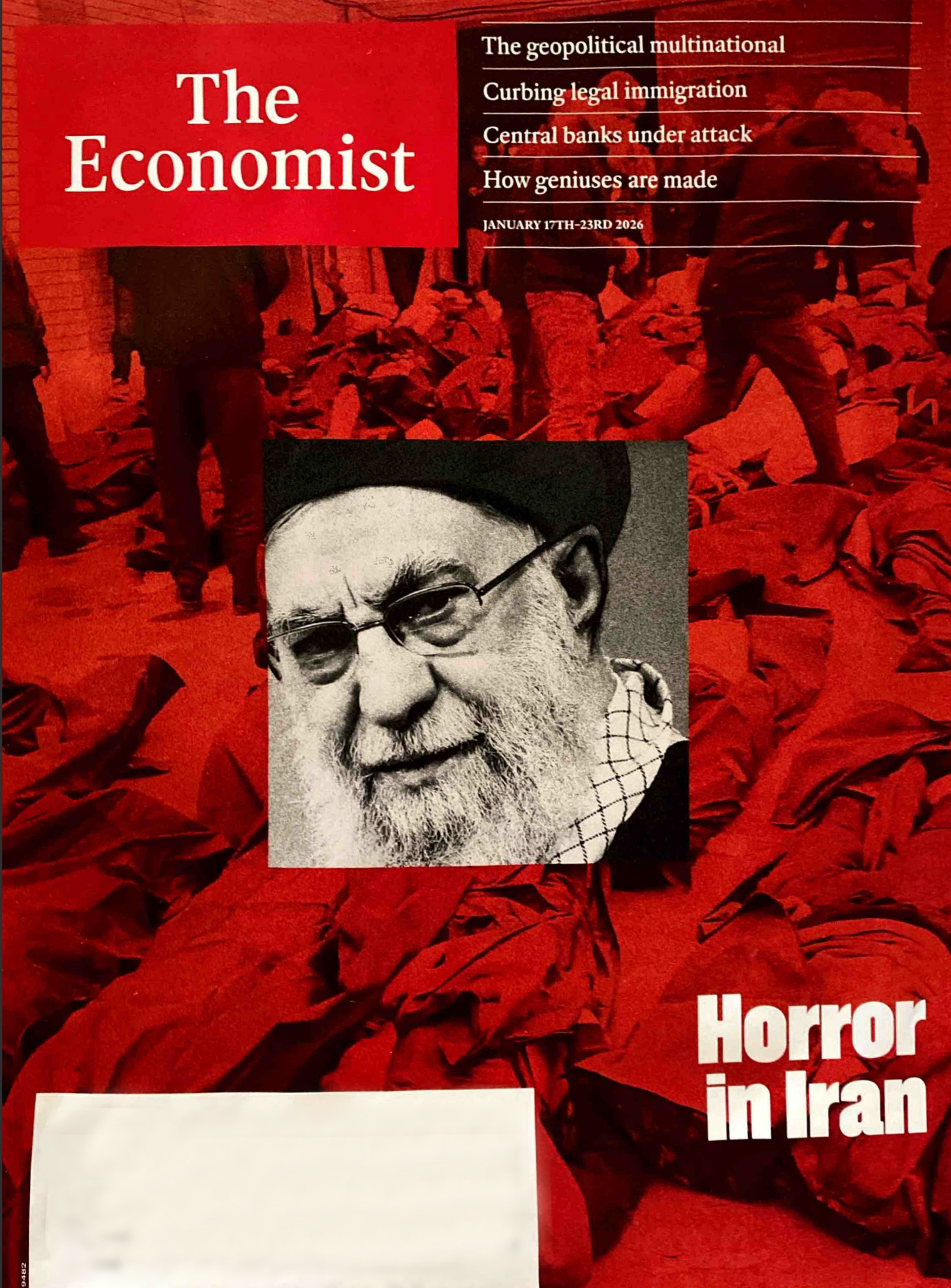
I recently saw the January 2026 cover of The Economist and it immediately caught my eye from a design perspective. It uses that iconic red background with a sharp black-and-white image layered over it.
It reminded me of a question a viewer asked: Which is better—a clipping mask or a layer mask?
The truth is, it’s not about one being “better” than the other. They often accomplish the same thing, but they do it in different ways. I thought this magazine cover was the perfect “copycat” example to play around with both techniques and show you exactly how (and when) to use them.
Watch the full tutorial here
Download the Resources:
Follow Along with Free Images from Pexels:
- Background Image: https://www.pexels.com/photo/people-enjoying-the-concert-1047442/ Subject
- Square Image: https://www.pexels.com/photo/photography-of-people-having-fun-954623/
- Economist Magazine Cover: https://designertofullstack.com/wp-content/uploads/2026/03/economist-cover-red-background-image-and-framed-black-and-white-image.jpg
The Goal: The “Economist” Aesthetic
The look we’re after uses two distinct elements:
- A bold, one-color background image (The iconic “Economist Red”).
- A high-contrast black-and-white subject layered on top.
Technique 1: The Layer Mask (Precision Control)
A Layer Mask is attached directly to a single layer. It uses grayscale values to hide or reveal parts of that layer (White = Visible, Black = Hidden).

- Best for: Cutting out complex subjects (like people) or creating soft, painted transitions.
- The “Dev” Logic: Think of this like an
opacityproperty applied to specific coordinates of an element. - Pro Tip: In the video, I show how you can “Select Subject,” apply a mask, and then use a white brush to “paint” back in details like legs or hair without ever deleting the original pixels.
Technique 2: The Clipping Mask (Shape-Based)
A Clipping Mask uses the layer below it as a frame. The top layer is only visible where there is content on the layer beneath it.
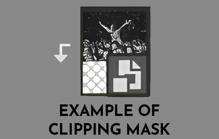
- Best for: Putting images into specific shapes (circles, squares) or text.
- The “Dev” Logic: This is very similar to the CSS property
overflow: hidden;on a parent container. - Why it’s great: You can move and scale the image inside the “frame” independently, which makes it incredibly flexible for UI layouts.
The Verdict: Which is Better?
Neither is “better,” but they serve different purposes:
| Feature | Layer Mask | Clipping Mask |
| Structure | Attached to the layer itself. | Uses the layer below as a boundary. |
| Control | Best for “painting” or fine-tuning edges. | Best for “framing” images inside shapes. |
| Flexibility | Great for complex cutouts. | Great for swapping images in/out of a UI element. |
What brought you joy today?
For me, it’s the small things—like my husband making me coffee every single morning. It’s the best way to start a day of designing and coding!
Let me know in the comments if you have a specific Photoshop or CSS technique you want me to break down next!