
We’ve all been there: Your desktop layout looks pristine. The columns are aligned, the spacing is perfect, and you’re feeling like a design god. Then, you click that Tablet or Mobile breakpoint icon, and suddenly… disaster.
Your beautiful side-by-side columns are squashed, text is overlapping, and the whole section looks broken.
Before you start manually dragging elements and “pixel-pushing” your way to a headache, there is a much faster way to handle this using the Wix Studio Section Grid logic.
Watch the Tutorial: Fixing Breakpoint Disasters
The “Disaster” Breakdown
The primary reason layouts break during breakpoint switching is that the section is trying to apply Desktop rules (like a 3-column horizontal grid) to a Mobile screen (which lacks the width to support it).
In Wix Studio, you don’t always need to delete elements or start over. You just need to change how the section interprets its contents.
The “One-Click” Fix for Mobile Layouts
When you switch to a Tablet or Mobile view and see your layout falling apart, don’t panic. It’s usually because your Section Grid is trying to follow Desktop rules on a screen that isn’t wide enough to support them.
The Fix:
- Select the Section (not just the individual element).
- On the right-hand Inspector Panel, find the Section Layout dropdown.
- Switch from Columns to Rows.
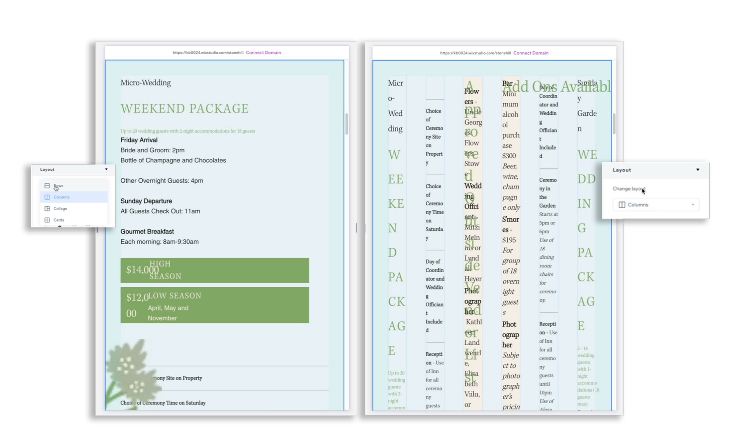
This instantly stacks your content vertically, giving you a clean mobile-ready foundation without you having to manually move a single pixel.
Pro-Tip: Section Layout vs. Stack Layout
While they feel similar, the Section Layout controls the high-level grid of the entire section, whereas Stacks are used for grouping specific elements (like a heading and a button) within those grid cells. Mastering the toggle between the two is the “secret sauce” to fast, responsive builds.
As a Fullstack Designer, why Consider Wix Studio?
As a “Designer to Fullstack” creator, if you’re looking for a tool that doesn’t limit your creativity but handles the “boring” technical stuff for you, then Wix Studio might be an option. Here are some reasons why:
- Managed Infrastructure: Unlike WordPress, you don’t have to “babysit” hosting, security updates, or PHP versions. Everything is enterprise-grade and managed by Wix.
- The Best of Both Worlds: You get the visual freedom of tools like Webflow or Framer, but with a built-in IDE (VS Code) and open APIs. You can stay no-code for the UI and go full-code for the logic.
- Native Business Solutions: eCommerce, Bookings, and CMS are baked in. You don’t need to string together 15 different third-party plugins just to take a payment.
Wix Studio FAQs
No! Wix Studio uses a cascading logic. Changes flow from Desktop → Tablet → Mobile. If you change a layout setting on Mobile, it stays on Mobile, leaving your Desktop version exactly how you designed it.
No. You can build 100% responsive, high-end sites using the visual editor. However, for those wanting to go “fullstack,” the platform allows you to add custom CSS and JavaScript whenever you need it.
More Wix Studio Tips & Tricks
Check out my other deep dives into mastering the Wix Studio ecosystem (Playlist):
Want to see a specific Wix Studio feature in action? Drop a comment below or on the video, and I’ll break it down in my next “Designer to Fullstack” short!