Recreating the Interlocking L and A for Dodgers Logo

R

In this installment of the CopyCat Design Series, we’re diving into the iconic LA Dodgers interlocking monogram logo. By studying and rebuilding this design in Adobe Illustrator, we’ll practice typography basics, anchor point editing, and interlocking letterforms—skills you can apply to your own monograms and logotypes.


A Brief History of the LA Dodgers Logo

The Dodgers’ “LA” monogram is one of the most recognizable logos in sports. Over time, the design has evolved from a simple pairing of slab serif letters into the refined, interlocking monogram we see today. Its slab serif roots and clever overlap give it both strength and elegance.

Todd Radom shared on X a letter sketching out the idea for interlocking L and A from 1957 (see below). To dig in deeper to the history of the LA Dodgers logo, check out this article on SportsLogos.

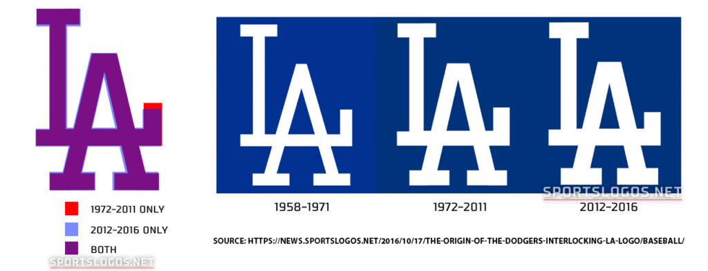
The adaptations of the interlocking L and A are shown below in this infographic by SportsLogos.net.

LA Dodgers linking L and A letter - source Sportslogos.net

Step 1: Starting with an SVG File

The first step is grabbing an SVG version of the Dodgers logo. Get it here. SVGs are scalable vector graphics—they’re lightweight, XML-based, and resolution-independent, making them ideal for Illustrator.

Once opened in Illustrator, I like to switch to Outline Mode (View > Outline). This lets me see only the vector paths, without fills, which is especially useful for reverse-engineering letterforms.


Step 2: Breaking Down the Monogram

The Dodgers logo is essentially a slab serif monogram. To practice, I start with Rockwell Nova Regular from Adobe Fonts.

This step also gives us a chance to review some typography vocabulary:

  • Serif – the small extensions at the ends of strokes
  • Stem – the main vertical stroke of a letter
  • Foot – the bottom serif where a stem meets the baseline
  • Baseline – the invisible line letters sit on
  • Cap Height – the top alignment line for capital letters
  • Crossbar – the horizontal line in letters like A or H
  • Apex – the top point of the A

Knowing these terms makes it easier to describe and edit type precisely.


Step 3: Converting Type to Outlines

With “LA” typed out, the next move is to create outlines (Type > Create Outlines). This turns live text into editable vector shapes.

I ungroup the letters so I can move the L and A independently. Then, I align the A so its crossbar overlaps with the foot of the L—just like in the Dodgers’ design.


Step 4: Refining the Letterforms

This is where the real fun begins. Using the Direct Selection Tool (White Arrow) and Pathfinder tools, I can:

  • Adjust serif widths for better balance
  • Delete unnecessary anchor points to clean up shapes
  • Use Divide and Unite in Pathfinder to remove overlapping serifs
  • Recolor the letters to check legibility against different backgrounds

These refinements are what transform Rockwell into something that closely resembles the Dodgers’ logo.


Step 5: Cleaning and Finalizing

Before calling it finished, I always go back into Outline Mode to double-check for extra anchor points or hidden counter forms. A clean monogram should be made of as few points as possible.

Finally, I recolor the monogram and place it on a background for testing.


Watch Video Tutorial

https://youtu.be/obTf-yg9KrA

Hello today for our Copycat Design series, we’re going to be working on an interlocking monogram for the LA Dodgers. So let’s take a look on the MLB.com Dodgers website. We can see this monogram in use and throughout the years it has been slightly adjusted. And in fact, on the blog, I have a Twitter post of an original letter of when this monogram was actually being created. So it’s worth taking a look. But to get started for this copycat, we are going to go to this website. Grab this SVG file that’s down here at the bottom and drag it to our desktop. So an SVG file can be opened in Illustrator. So we will save file open and navigate to our file and say open. So it’s white so I can’t see anything. I can go to View > Outline to be able to see the logo. So the logo is vector. The SVG file is often used on websites because it allows for scalability and really crisp design as well as control for thickness, color, animation, all kinds of other things because it’s using XML, so it is coding friendly. I have grabbed the logo command C, I’m coming to my new file and I’m saying command V for paste. And if I hold down shift and scale from the corner I can make it large. And this is going to be our example that we’re going to try to be copying. So what we see about this logo is it is an interlocking L and A. It is a slab serif which means the feet, the serif on our letters are geometric. They are basically rectangles. That’s also known as Egyptian slab. It’s slightly adjusted. We’re going to use Rockwell to practice and make a similar type of lockup. Let’s first dig in with some typographic terms. So this is the Rockwell font. And we talked about serifs which is French for feet. And basically it is the extra pieces that come off of your letter. So we can see them highlighted here. Typically they are horizontal. But in something like Rockwell you can consider this top serif off of the L to also be a serif. We have the term stem, and stem is the main vertical or in the case of the A sometimes diagonal stroke of a letter. Now feet are different than serif. Feet is talking about the baseline of where your letters are. And it is part of the letter stroke that rests on that baseline. So the baseline is if I pull a ruler, this is the baseline. Apex. That’s the point of where two strokes meet. So we see that in A’s and M’s crossbar. That’s the horizontal stroke that connects two sides of a letter. And here’s a nice drawing of our baseline that I showed with the ruler. And then we have a cap height line. And that’s for the capital letter. All right. So those are some terms that apply to the work that we are doing today together with L.A. I am going to open my layers panel. Find this grouping which when I select it on my artboard I can then look in my layers, and where I have this blue rectangle that indicates the selected art. I can lock it. That way, I don’t move this around by accident. I’m going to use my type tool. And for this I’m going to use a line of text. So that’s a single click. And I’ll hold down shift and do an L and an A. Go back to my selection arrow which is black shift click from the corner and make it larger. Next we’re going to set the font to Rockwell. You can do that if it’s not already default on your computer. You can go to find more. Type in Rockwell. We’re going to use the font Rockwell Nova Regular. So when we’re adding an Adobe Font we click the icon that says add. And I’ve made a copy so that I have one version as text. I can do that with option and drag to duplicate as well. So one version I am going to take the type and say Type > Create Outline. Now I can see that I have anchor points and if I switch to my white arrow, I can actually manipulate this shape. And that is different than when I select the L and A. Up here the baseline is highlighted. There are no anchor points. This is still text. I could double click into this and change or add another letter. Down here: once, it’s created outlines it is no longer text. I cannot change the letter and it is just a shape. We’re going to say Object Ungroup so that we can click off and move the L differently than the A. All right. So I am going to scale my L. So I shift click on my keyboard and use the corner to kind of line it up as much as I can. And then I have my A here and I’m going to move them over to the edge. So what we can notice here is our crossbar of the A is combined with the foot of the L. Right so this becomes one and they are the same height. So if we look here we can see the A isn’t quite the same height and there. But we kind of want to line it up some maybe in the center. And we realize that the foot of the L needs to move over to the right. So how we’re going to do that is move the A out of the way. We are going to use our white arrow and drag over this point, this point, this point in this point. So we have four points that we can tell are active now because they are filled blue. And the other points which are not active are still filled white with them selected. I can click my right arrow on my keyboard and start moving those four points as a unit to the right. So this is how we are stretching the foot of this L to make room for the A. All right. So I can do it that way. I can also hold down shift on my keyboard and drag. If I click anchor shift click anchor shift, click anchor shift click anchor. And then grab on the edge. I can pull it and my shift is keeping me in line horizontally. So I let go with my mouse first and then my keyboard okay. All right. We’re going to make this a different color so we can see what we’re doing. And now we have the A. So we’re going to try to center the A. And if we compare across we can see there’s a little bit of space here and a little bit more space here. Right. All right. So we can just kind of eyeball it here and I can come back. Shift shift shift shift. And grab my corner. Sometimes it’s difficult to get it. We’ll try again I grab the stroke on the edge holding shift and bring it in. I can also use my keyboard. That looks pretty good, right? We’ve pretty much, copied what’s happening there. Now, the next thing that we notice is, of course, this font has a little bit different serif widths. These are in a bit more. Let’s say I want to bring in just those two. I could select them and say 123, four, five, six, seven. I could do the same here. Just grab those two. I’m doing left arrow 123 4 or 5, six seven. So we could make fine adjustments like that. Perhaps it’s the thickness that we would want of this serif. We could do that by selecting one, two and then using my keyboard. 1234567. We can see it’s a little bit shorter. So I grab this top two point. I could then click on the stroke edge, bring them down some so we can make adjustments as you would want when you’re doing your own copycat designs. But the next thing we can see that is important that we need to remove is that this left serif and this right there are not there. So the next thing we’re going to do is use a line tool. And when we use line we have to have a stroke. So I am going to rotate so that my stroke is yellow. And I can click and then drag the direction that I want. And if I zoom in, what’s important here is that I don’t want my stroke to accidentally take a hook out of that stem, so I really want it to be aligned on the outside. So if you have one stroke aligned the way you want, you can go to Object > Transform, reflect. It’s selected. So I can see it’s reflecting I have a vertical reflection. And I click copy and it will make a second one for me. Now I can grab that line and make sure it is aligned as well. All right. So with those two there I’m going to select my A. That’s a shape my line and my line. Go to Pathfinder Window > Pathfinder and say Divide. So when I click divide it separates wherever that line is. So now I can click off. Go to my white arrow and I can click on the color. So in the middle to select it and delete and delete. Now I can see I didn’t get it quite lined up. And that’s all right because we can right click and see that I actually just have these two points that I don’t want. So if I go into the pen tool where it has the negative and I click on an anchor, it will delete it. So I can go ahead and just delete those extras. All right. So now this is pretty much what the LA logo looks like. So we know that with the logo we want it to be one shape that moves United. And we can color with one fill. So the next step is to shift click both of the parts of the logo. Do shape mode unite. Look what has happened. It filled in the A. So that is a common issue. We’re going to undo and I’m going to go back to preview. If that happens when you’re working on any letters that you’re combining, you can simply select just the letter and the two letters and now say unite. And it will no longer fill in that counter form. So the difference was when I dragged across and I grabbed everything, I was grabbing that counter form too and saying Unite to it. So instead you want to use your white direct select just the black of the A, just the yellow. And now say unite and you can see you do not get the counter form. Once it’s united, we can rotate through any color that we would want and it changes. And it still has a transparent background. We can move it around. We can add a color behind it. Let’s just say we do that object arrange send to back. And that is the idea. Now what you can see is I still have that counter form that’s kind of hidden in there. So we want to go to View Outline. And if you have counter forms that divide makes an extra shape. You want to come in and clean it up. You don’t want your logos to have extra random shapes. So I can come in with my white arrow. Select the triangle, delete, delete until nothing else is highlighted. All right. Now I truly have just the outline and I can go back to View preview. So those are your tips. I hope this is helpful as you start to think about how you can use interlocking design technique for your monograms and logo types. Thanks for watching this copycat video. I’d love to hear from you. Drop a comment about what you liked, what I can improve, or what topics you’d like me to cover next. Or if you’d rather take a moment to reflect and share the simple thought: What brought you joy today? Until next time, have a great day and happy designing!Hi, so today we’re going to work on units of measurement in Photoshop. So, if you have a document open, you can come to your Photoshop and this is on a Mac, Settings> Units & Rulers and you can look over here on the left side for Units & Rulers and you can set it to pixels, inches and other measurements, but pixels and inches are probably what you use the most. So we’re going to go ahead and set this to inches. Alright, now we’re going to navigate to a rectangle, so a vector shape in PhotoShop and if I draw it (it is drawn) and I want to draw your attention to two places. One is the Properties window that’s over here on the right. If you do not have your Properties window, and I’ll see how visible you can go to Window > Properties. Okay, Window > Properties. And because I have the box selected, you can see that by the blue nodes around the corners. And I have the units of measurement set to inches for my rulers. This property box is showing me my width and my height in inches. Now, interesting, the dialog box up here at the top is showing pixels. So that can be kind of frustrating because a lot of times we get used to working from this top box. So a trick to be able to change it to the units of measurement you want. On your Mac, you’re going to select the where that pixels is and you’re going to click control click and that’s going to bring up a dialogue. So if you’re just trying to click around you’re not going to get a drop down dialogue. But if you control-click on your Mac and then click where the PX is shown or the IN you can now switch that to inches and you can see now it’s showing me 3.91 inches the same as in my Properties box. Same trick. Click control-click on your Mac, and you can switch between units so your rulers are not changing here but you are able to control click and change what you’re seeing in measurement. Now what I have found is that these boxes if I have changed this to inch and this is still on pixel, if I open and create a new file and I draw a box, you can see that this is staying the same so it doesn’t seem to be saved with the file it seems to be saved with your Photoshop preferences. So you can see that I still have units of measurement or inches here, but this box is showing me inch and this one is still showing me pixels. alright the other thing to think about is if I click once with my box. And you can see it is actually changed even here in my dialog box at the first one is inches the second one is pixels. Now even in this dialog box, I can control-click and get it to inches too so let’s say the these are inches but I could actually type in and say 50px 50px and when I click ok it’s made it very small 50 pixels. So within any of these dialog boxes I can see here it’s 0.35 inches or 50 pixels and if I would control click switch back to pixels I can see it’s 50.4 pixels here. But in general those are some of the tips for how you can change units of measurement within these dialog boxes of create rectangle properties and also your shape bar up at the top. Alright, I hope that helps.


Design Reflections

Recreating logos like the Dodgers’ monogram is an excellent way to practice design fundamentals. Along the way, you’ll sharpen your Illustrator skills and expand your typography vocabulary.

Most importantly, you’ll see how letterform modification—adjusting a serif, moving a crossbar, or interlocking letters—can turn ordinary type into a powerful, memorable logo.


👉 Want more? Check out other posts in the CopyCat Design Series, where I rebuild famous logos and recreate compositions while explaining the design decisions behind them. Also, you can explore more interlocking logos in sports in Football Archaeology’s article, “Todays Tidbit: Wrapped up in Interlocking.”

About the author

Kelly Barkhurst

Designer to Fullstack is my place to geek out and share tech solutions from my day-to-day as a graphic designer, programmer, and business owner (portfolio). I also write on Arts and Bricks, a parenting blog and decal shop that embraces my family’s love of Art and LEGO bricks!

By Kelly Barkhurst

Recent Posts

Archives

Categories