
Getting your text perfectly left-aligned in InDesign might seem simple, but if you’re working with quotes, headlines, or columns, things can get tricky. In this post, I’ll show you three professional techniques — from optical margin alignment to manual indents — that make your typography clean, precise, and visually balanced. Whether you’re designing a book, poster, or magazine layout, these tips will help your text look polished.
Optical Alignment Tips in InDesign Video
What are the best settings to use when aligning your text to the left in InDesign? Well, that depends on your goals. Here are a few options. Watch or read below.
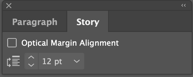
1. Use Story > Optical Margin Alignment
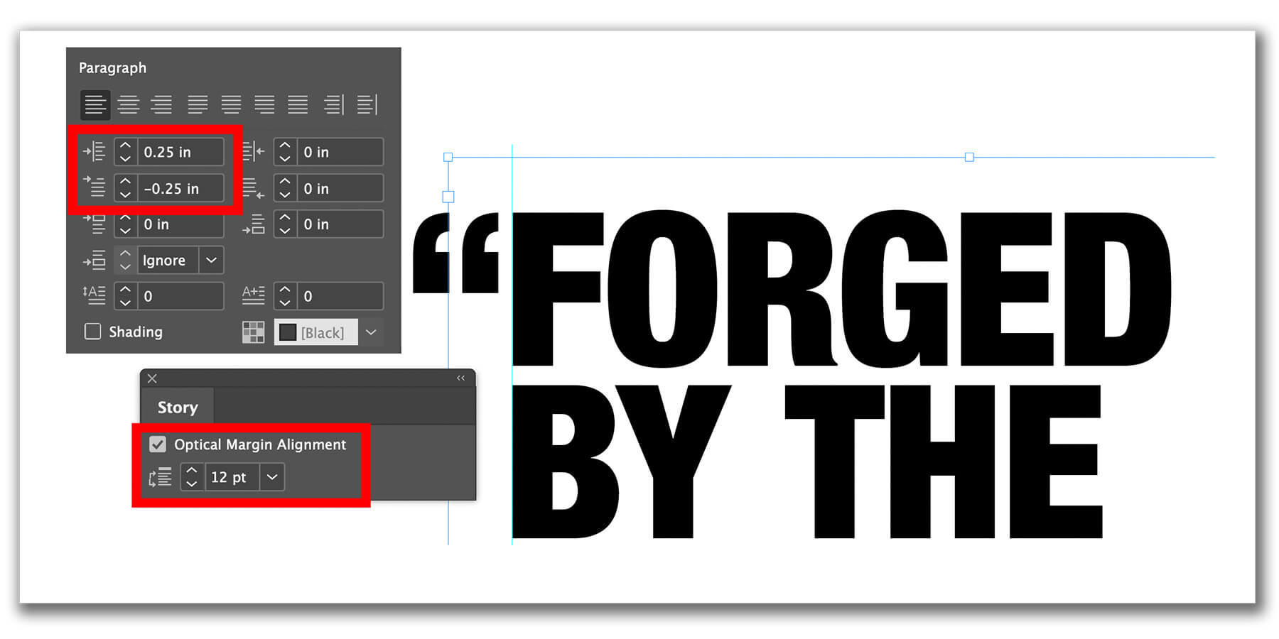
What it does: Allows punctuation, serifs, and edges of letters to “hang” outside the text block (hanging punctuation)
Where to find it: Window > Type > Story > Check Optical Margin Alignment
Tip: Adjust the pt box to control how far characters hang into the margin
Best for: Aligning columns of body text for magazines, books, or newspapers
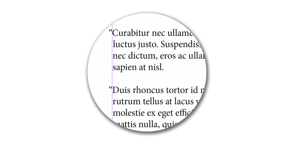
In InDesign, there is a window called Story. The key feature of this window is a checkbox labeled “Optical Margin Alignment.” Checking this box improves the optical alignment of columns of text. Designers call this feature “Hanging punctuation.”
This allows punctuation, such as quote marks, serifs of letters, and even edges of some letters to “hang” outside of the main content’s vertical alignment, essentially moving them slightly into the margin. The pt box (12pt is default shown below) is your setting for how far to move them into the margin.
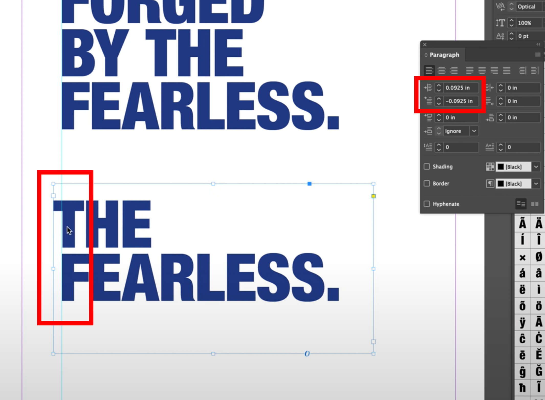
2. Use Left Indent or First Line Left Indent Only
What it does: Moves the start of your text to adjust alignment manually
Best for: Headlines, subheadlines, or situations where optical margin alignment isn’t enough
Tip: Combine with story panel settings for precision
Best for a headline or subheadline (instead of a paragraph or column or text) you can hand align using the left indent and first-line left indent options in the Paragraph window. These settings can be adjusted with or without the Story Optical Margin Alignment selection.
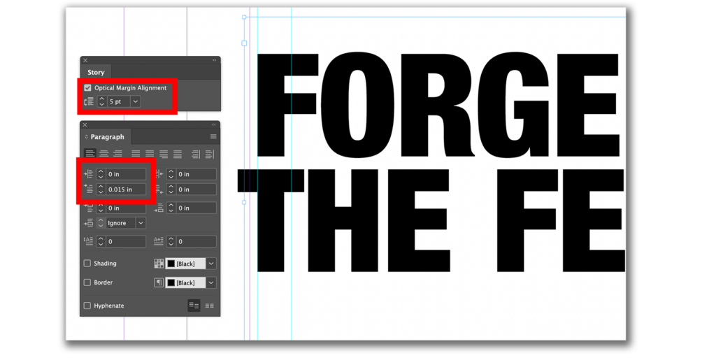
3. Combine Indents and Optical Margin Alignment
Why combine: Gives you full control over alignment for both body text and headlines
Best for: Poster headlines, magazine covers, or any text where visual perfection is required
Tip: Fine-tune the first line and left indent for capital letters or hanging quotes
Now that you know how to use optical margin alignment and indents, try experimenting with your own InDesign layouts. Watch the videos above for a step-by-step demonstrations, and don’t forget to subscribe to the blog or YouTube Channel for more design tips!