
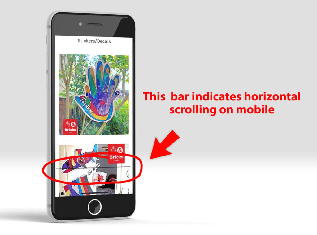
Have you ever noticed in your browser window that there’s an unintended horizontal scroll bar?
Or, maybe on your iPhone, that there’s an unexpected horizontal dark line that shows up when you touch the screen?
Well, that means your content is wider than the viewport, and there are easy ways to fix this.
CSS code snippet that removes horizontal scroll bars on desktop and mobile
Please note that this CSS code snippet is applied to both the body and the HTML tag. Just the <body> or just the <html> will not hide the horizontal scroll bar on BOTH desktop and mobile views. Also, for newbies, note that these are HTML-level elements, so they do not have a period (for classes) or # (for ids) before them in the CSS.
body, html {
  overflow-x: hidden;
}
A bit of background: as defined by W3School, in your webpage’s structure, the <body> contains all the contents of an HTML document, such as headings, paragraphs, images, hyperlinks, tables, lists, etc. and the <HTML> tag is the container for all other HTML elements (except for the <!DOCTYPE> tag).
How does this work?
This overflow-x:hidden CSS applied to body and HTML works by removing the ability for these two top-level elements to scroll horizontally, therefore hiding horizontal scroll for all elements on your webpage.
To also consider: viewport
I suggest also looking at your viewport metadata. In the HTML5 Boilerplate, the defaults for viewport are shown below.
<meta name="viewport" content="width=device-width, initial-scale=1">The width=device-width aligns the width of the webpage with the device’s screen width, which varies. The initial-scale=1 or initial-scale=1.0 sets the zoom level on page load.
Usability
Keep in mind that users expect to scroll vertically on websites, but horizontal scrolling, in most cases, is not an expectation. Exceptions to this “rule” are experimental, artistic, playful websites, but for most content and e-commerce websites, you do not want users to scroll horizontally.
The best way to prevent horizontal scrolling is to create both a mobile and desktop view of your website. Creating styles for several view sizes of your website is known as responsive design and is absolutely expected in websites in 2021 and later!
If you’re already using responsive design, ensure that you do not inadvertently have large fixed-width images that might display larger than a mobile viewport. A responsive image class can help with that issue (CSS snippet shown below)!
.img-fluid {
    max-width: 100%;
    height: auto;
}
If you’re using responsive images and media queries for your CSS and still have elements triggering an unintended horizontal scroll, try declaring overflow-x:hidden on both your body and HTML class.
Tailwind Class for Scrolling
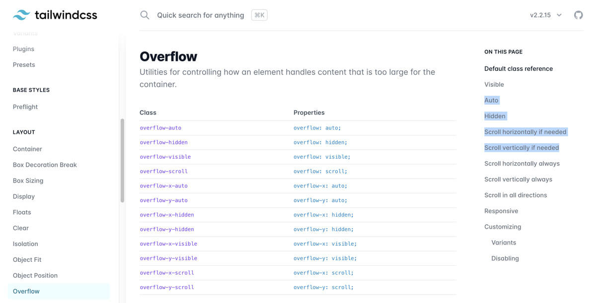
On another note, if you’re using Tailwind CSS, Layout Classes in Overflow address scrolling. You can apply the Tailwind CSS class .overflow-x-hidden to any element you choose.
.overflow-x-hidden	{
      overflow-x: hidden;
}
I hope this easy fix has solved your horizontal scroll bar woes! Another favorite CSS tip is using CSS pseudo-elements ::before and ::after to stylize PDF and other document types.