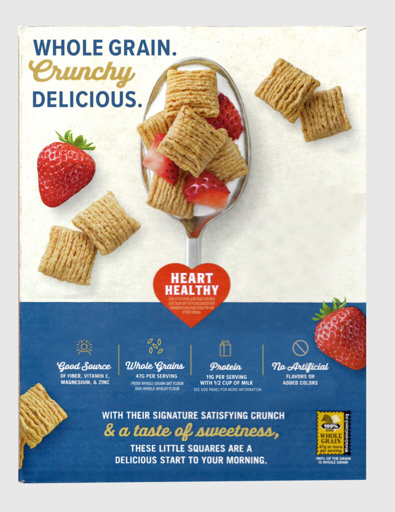
As designers, we often just can’t help it. We see alignment issues “in the wild” everywhere. Menus, signs, packaging, nothing is safe. (And, don’t get me started on typos!) Everyday items like the back of a cereal box often provide the best teaching moments.
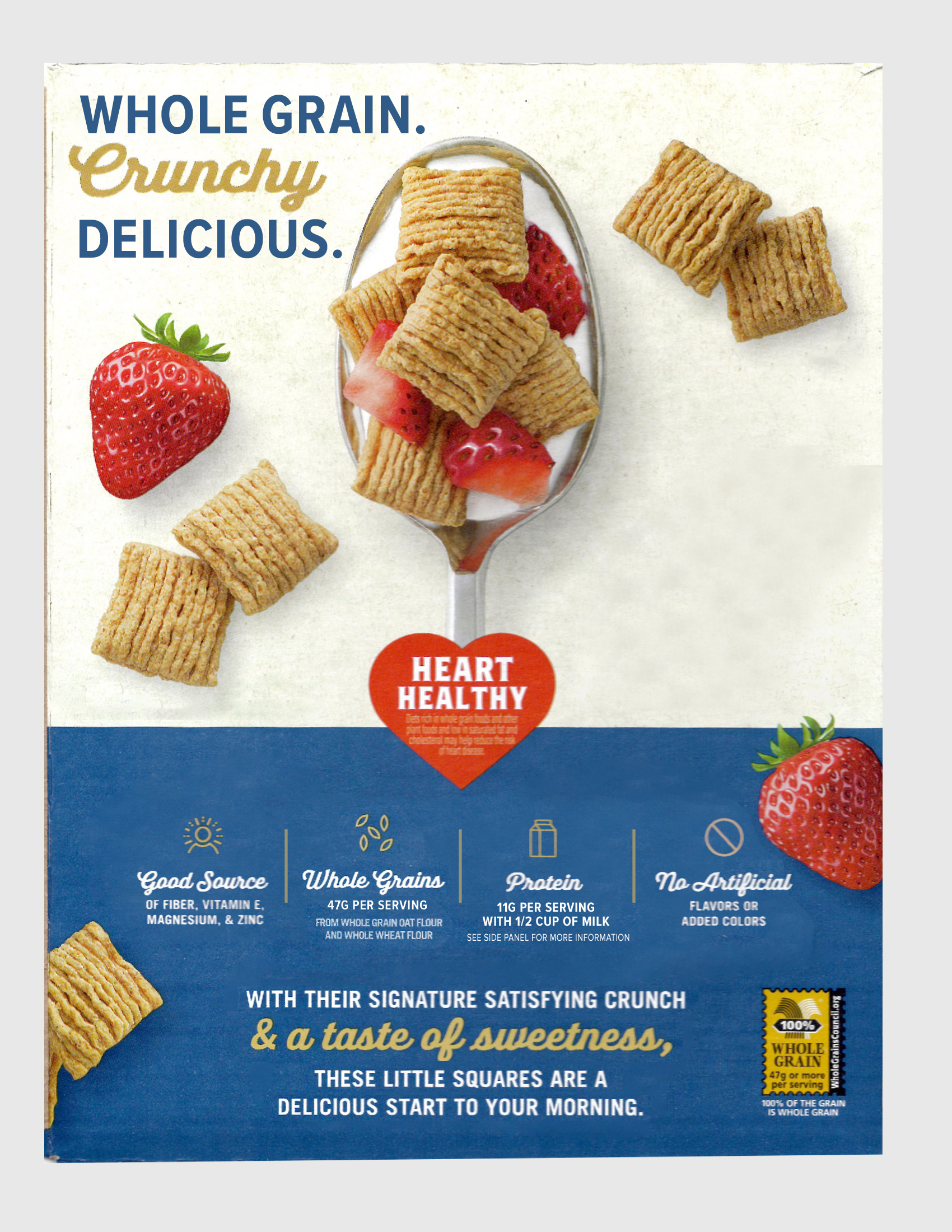
In this post, I walk through a real-world example pulled straight from my breakfast table. The back of a Quaker Oatmeal Squares box is almost perfect. In the video below, I break down what is working, what feels slightly off, and the small adjustments that take a layout from almost there to polished and intentional.
Why Small Design Details Matter
The design on this box is not bad. It is already solid with a clean layout, clear hierarchy, and friendly copy. But small misalignments and inconsistencies can leave the design feeling unbalanced. A new designer might feel like the design could be stronger, but often cannot explain what feels wrong.
This is where we get to sharpen our critical design eyes. I find that studying an almost perfect layout is often more helpful than fixing a completely broken design.
Step 1: Checking Alignment With Guides
In Photoshop, a simple way to check internal margin consistency (or padding) is to drop rectangles into your layout and to use temporary guides to check alignment. This helps reveal where margins drift.
Inside the video, you will see that this technique reveals:
- Top padding that is slightly inconsistent
- Left side content that is not perfectly aligned
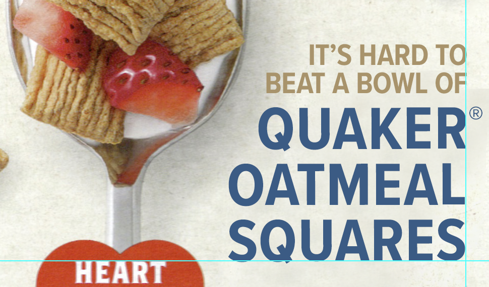
- A right-aligned text block that could use manual hanging punctuation to align the registered mark optically.
These small inconsistencies pull a design off-center, even when everything appears to follow a grid.
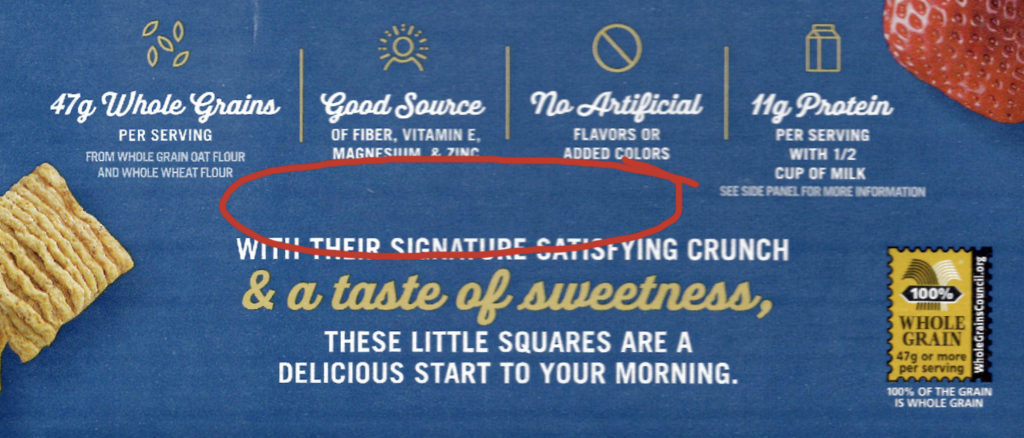
Hang a Registered Mark when right-aligned
In this image, you’ll see that a choice to align the typeforms has been made. This allows the registered mark to hang on the right. Also note that the top of the HEART headline aligns with the baseline of the word “SQUARES.”
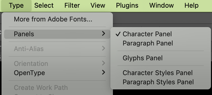
To create a Registered Mark in Photoshop, either copy and paste from the web ® or use the Glyphs panel in Photoshop. In the newest versions of Photoshop, go to Type > Panel > Glyphs.
Learn three ways to add a grid in Photoshop.
Step 2: Roman Hanging Punctuation
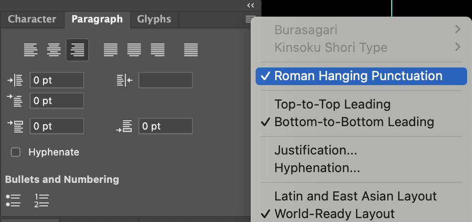
On the right side of the box, the punctuation and registered mark push the alignment inward. This is where Roman Hanging Punctuation helps. It is one of those typography tools most people overlook.
Photoshop only allows the “Roman Hanging Punctuation” setting to be active when you are working inside a true text box.
Inside the video, I show:
- How to place your text into an area text box (click and drag with the Text tool)
- Why hanging punctuation creates cleaner edges (the key is creating vertical optical alignment)
- The difference between aligning to punctuation and aligning to the actual letter shapes
Step 3: Optical Tweaks (Leading and Baseline Shift)
Even when the tools align everything mathematically, your eye may see something different.
In the video, I adjust:
- Leading to a two-line headline
- The baseline and size of the registered symbol are aligned.
- Discuss that some letterforms (with arms and curvatures, for example) require manual moving to appear aligned.
These micro adjustments are what make packaging (and all graphic design) look professional and polished.
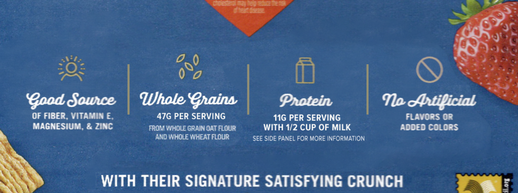
Step 4: Centering and Hierarchy
In the lower section of the box, a few elements appear centered at first glance, but are not visually centered and instead create trapped negative space in the middle of the design. As designers, we want to move negative space to the outside of our designs.
You will see me:
- Center a small ingredient note
- Align the supporting copy under the icons
- Nudge the “enlarged image” note so it feels intentionally placed
Small choices like these add up to create a clear, balanced layout.
Why I Enjoy These Breakdowns
Design critiques help me keep my eye sharp. Looking at real-world examples, especially those that are already well-designed, encourages you to think about why something feels off and how a few adjustments can fix it.
It is a skill you can practice anywhere. Grocery aisles. Restaurant tables. Scrolling through social feeds. There are design lessons hidden everywhere.
If you are learning design or want to understand why the details matter, these everyday critiques can help you improve your work.
Practice on Your Own
Here you can download the cereal box image and add your own:
- It’s Hard to Beat A Bowl Of (use a sans serif font, right align and use the eye dropper tool to select the brown color)
- Quaker Oatmeal Squares (use a sans serif font, right align, use the eye dropper tool to select blue and manually adjust the Registered mark to hang off the right side)
- Align the brown text that reads, “Enlarged Image”
- Align the brown text that reads, “FRESH FRUIT ADDED AS A SERVING SUGGESTION.”