
Have you ever added a new page to your WordPress site, confirmed it looks great on your desktop, and then realized the new page is completely missing from your mobile menu?
It sounds like a simple fix, but as I recently discovered while troubleshooting a site built with Beaver Builder, this issue can often have multiple layers. If your mobile and desktop menus are out of sync, explore this step-by-step “rabbit hole” guide to get them back in alignment.
Step 1: Check Your Page Hierarchy
Before diving into menu settings, ensure the page itself is organized correctly. If a page is meant to be a dropdown item, it needs to be assigned a Parent Page.
- Go to Pages > All Pages in your WordPress dashboard.
- Find your sub-page and click Quick Edit.
- Under the Parent dropdown, select the main category page (e.g., “Our Services”).
- Click Update.
⚠️ SEO PRO TIP: Changing a page’s parent often changes its URL slug (e.g., from
/my-serviceto/services/my-service). If you make this change, ensure you have a 301 Redirect set up so you don’t lose traffic or create a 404 error for visitors!
Step 2: Identify Which Menu is “Active”
WordPress allows you to create multiple menus (Main, Footer, Mobile, etc.). A common mistake is updating the “Main Menu” while the mobile site is actually pulling from a different one.
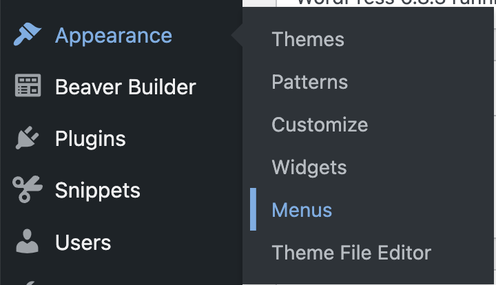
- Navigate to Appearance > Menus.
- Look at the top dropdown: Select a menu to edit.
- Check if you have a specific “Mobile Menu” or “Footer Menu” selected for mobile display.
- If your mobile site is using a different menu than your desktop, you’ll need to add those new pages to both menu lists. Don’t forget to click the SAVE button.

Step 3: Troubleshooting Theme Builders & Hidden Templates
If you’ve updated your WordPress menus but the mobile view remains stubbornly the same, you’ve likely hit the “Theme Builder” wall.
Modern builders like Beaver Builder, Elementor, or Divi often bypass the standard WordPress header. Instead, they use custom templates or “Saved Rows” to build the mobile experience. If your site was designed by a pro (or a service like GoDaddy), they may have built a unique mobile header that functions independently of your desktop one.
1. Check for “Responsive Toggle” Visibility
Many designers create two separate versions of a header: one that only appears on desktops and one (the “hamburger” menu) that only appears on mobile.
- The Problem: You might be editing the “Desktop” header module, but the “Mobile” version is a completely different module hidden in the settings.
- The Fix: Open your header in your page builder and look at the Visibility or Advanced settings. Check if there is a module specifically set to display only on “Small Devices.”
2. Look for “Saved Rows” or Global Templates
Sometimes, the mobile menu is actually a Global Template or a Saved Row being pulled into the header from a library.
- The Problem: The header is just a “container,” and the actual menu content lives in a separate template file.
- The Fix: Look for modules labeled “Off-Canvas,” “Saved Row,” or “Template.” You will need to find that specific template in your builder’s library (e.g., Beaver Builder > Saved Rows) to update the menu source.
3. The “Hidden” Menu Source
Once you find the right row or template, check the module settings. In my case, I found that the mobile menu was actually set to pull from the Footer Menu instead of the Main Menu.
- The Fix: Ensure the “Menu Source” in your mobile/off-canvas module is pointing to the correct, updated WordPress menu.
The Results
By syncing these layers—Page Nesting, Menu Selection, and Builder Modules—you ensure that your users have a seamless experience whether they are sitting at a desk or browsing on the go.
Summary Checklist:
- [ ] Is the page correctly nested under a Parent Page?
- [ ] If nesting is changed, did you set up a redirect for the new URL?
- [ ] Are the new items added to the specific menu assigned to “Mobile”?
- [ ] Is there a hidden template/row/section overriding your header?
What Brought You Joy Today?
At the end of every tutorial, I love to share a little personal spark. Today, it was my little one’s giggles and yogurt-covered smiles at the breakfast table.
Is your menu still giving you trouble? Leave a comment below and let’s figure it out together!