
When I set out to create a centered logo in Wix Studio, I thought it would be a simple task—especially coming from a hand-coding background where I could control every element and position precisely. I expected that IDs or basic CSS positioning would be enough to place the logo and have it play nicely with dropdown menus. But like any builder or framework, Wix Studio has its own quirks and limitations.
Every platform and framework has unique behaviors, edge cases, and gotchas that can make even seemingly straightforward designs require careful thought and sometimes unconventional solutions. This project reminded me that designing in a visual builder often means adapting your approach to the framework, not just transplanting the techniques you’ve used in raw code.
The Visual Design Idea
On desktop, I wanted a centered logo that is slightly negatively positioned so it overlaps the next section below it, which might be an image or a hero video. Meanwhile, the dropdown mega menu lives underneath this header section, and users need to be able to move from one dropdown item to another without the logo accidentally “catching” their cursor and closing the dropdown mega menu.
With basic CSS’s z-index, I could place the logo visually where it needed to be. But functionally, the Wix Studio dropdown failed: moving horizontally across the screen (for instance, from the Experience text link to the third image shown, “Press and Awards”) meant the cursor passed through or over the centered logo. Touching the logo immediately closed the mega menu dropdown, breaking the navigation.
This dropdown mega menu usability problem initiated a VERY long chain of experiments.
What I Tried and Why It Failed
1. CSS Targeting Using the Logo’s ID
My first instinct, and how ChatGPT advised me to, was: “Just target the logo by ID.” This is normally the most precise and stable way to reference an element in HTML code.
But – and this is a big deal – Wix Studio rewrites IDs during rendering. Every time I refreshed the page or duplicated components, the ID changed. Any CSS using the old ID immediately broke. So while this would be best practice in hand-coded environments, it simply was not feasible in Wix Studio.
This was the first clue that I needed to rely on classes, because Wix preserves classes, but does not preserve IDs.
Deeper Dive
Wix Studio uses a proprietary selector engine called $w. When you name an element #myMenu in the Wix Editor, that isn’t actually the HTML id in the final source code. It’s an alias. Wix rewrites the actual DOM ID to a system-generated string and maintains a “map” so that when you type $w('#myMenu') in the Velo Code, it knows to go find the mangled ID comp-l5x9zq....
However, your CSS does not access that “map” so you can style by ID in your CSS in Wix Studio.
2. More Complex CSS Selectors and Attempts at Hover Logic
Before giving up on pure CSS, I tried:
[aria-expanded="true"]selectors- sibling selectors
- deep combinators
- hover chains meant to detect when a dropdown was open
- turning off pointer events dynamically
These should have worked in normal HTML. But Wix Studio wraps elements in multiple nested containers and does not expose the real DOM structure in a stable, predictable way. So even when our selectors were “right,” they didn’t hit the intended element.
I’d get close, but not quite functional. Or we’d fix one dropdown but break another.
Eventually, it became clear: the structure Wix generates is too dynamic, too wrapped, and too protective for these CSS selectors to be fully reliable.
3. Duplicating the Logo Inside Each Dropdown (A No-CSS Attempt)
When CSS seemed to be the limiting factor, the next idea—also suggested by ChatGPT at one point—was to avoid CSS triggers altogether and instead embed a separate logo inside each dropdown.
Theoretically, this would prevent the cursor from ever leaving the dropdown when crossing over the visual logo.
But this approach quickly fell apart:
- The Wix Studio EDIT UI doesn’t allow precise absolute or XY positioning for inner dropdown content
- The dropdowns jumped, overlapped, or shifted unpredictably
- Duplicating and maintaining the logo per the dropdown was tedious
- Responsiveness was inconsistent
- Any small layout change requires updating multiple copies of the logo
It technically “worked” for one menu, but scaling it was too fragile and time-consuming.
4. Exploring JavaScript Options (And Why That Was Impossible)
My next thought was: “Fine, I’ll just use JavaScript to disable pointer events when the dropdown opens.”
But Wix Studio does not expose the mega menu’s open/close state in Velo (Wix’s coding layer).
There are:
- no events
- no listeners
- No API to detect hover or expanded states
- No DOM access to modify the menu behavior
Currently (Spring 2026) Wix intentionally locks down the navigation and dropdown system for stability. So custom JS was not an option.
This closed the door on any dynamic scripting solution.
5. Custom Menu Route
Another path I seriously considered was abandoning Wix Studio’s built-in dropdown menu system entirely and building my own mega menus from scratch. That would have given me complete control over the structure, classes, positioning, and hover behavior, hopefully, just like hand-coding.
But it would also have meant recreating keyboard accessibility, mobile behavior, animations, responsive logic, and state handling that the native Wix menu already handles. In a normal coding environment, that tradeoff might be worth it, but in Wix Studio it felt like reinventing the wheel—and introducing more complexity than the problem justified. The native menu system is powerful, but it’s also locked down in ways that limit customization, so replacing it wholesale would have been a much bigger project than the original goal of centering a logo.
6. Returning to CSS, But This Time Using a Custom Class (The Winning Approach)
After eliminating IDs, brittle selectors, duplicated logos, and JavaScript, I finally returned to CSS with a much simpler idea: give the logo and the container holding the drop-down menus a custom class and target them with that class.
Wix preserves classes no matter how many times components are duplicated or rendered.
And with two clean classes and two CSS rules, suddenly everything became controllable.
The Final CSS That Solved Everything
The first step is adding a custom class to the logo image. Select the image in the Layers panel, then add a class in the Custom Class field (developer panel at the bottom, CSS tab). I used the class top. Wix generated an additional class wixui-top and kept my class top and the wixui-top class in the final HTML.
Next, STACK your dropdown menus (a specific element grouping in the layers panel). Then, give a custom CSS class to the container that holds the menus. I used the id #menus and the class .menus.
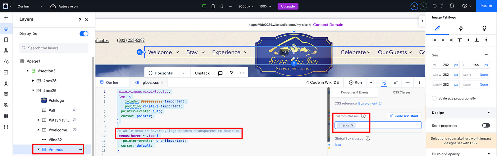
Finally, write the CSS. The CSS declarations below move the logo to the top and block pointer events when the menus are hovered, allowing the active dropdown to remain open even when the user passes over the logo. For tablet and mobile, I then needed to adjust the hamburger menu background (visible on mobile and tablet views) to be above the logo.
/* Ensure the logo stays visually on top */
.wixui-image.wixui-top.top,
.top {
    z-index: 100000 !important;
    position: relative !important;
    pointer-events: auto;
    cursor: pointer;
}

/* While dropdown is hovered, logo ignores mouse events */
.menus:hover ~ .top {
    pointer-events: none !important;
    cursor: default;
}

/* Moves hamburger menu background above the logo */
div[data-hook="hamburger-overlay-root"] {
    z-index: 100001 !important;
}
Why this works
- The
.topand.menusclasses are stable and never rewritten - The logo sits visually above everything else
- Pointer events automatically switch off when a dropdown is hovered, preventing the logo from “breaking” the user’s path across the menu
- Everything stays centered and aligned with no duplication needed
Using a stable Wix Studio CSS Class solved what all the earlier problem-solving attempts could not.
How to make the top z-index centered logo work on Mobile and Tablet Views
At first, I set an extremely high z-index on the logo — 999999999 — to keep it above everything else. But then I ran into a problem: on tablet and mobile views, the logo overlapped the navigation menu. On these views, I wanted the hamburger menu overlays to be the top layer.
When I asked AI for help, I was steered in the wrong direction (as so often happens). Eventually, I realized the solution was simpler than I thought. I needed to adjust the z-index, but the question was whether to raise the hamburger menu content or lower the logo. I chose the easier approach: keep all the default (Wix generated) hamburger menu styles intact and just lower my logo’s z-index.
Here’s how I solved it: I opened Google Chrome Inspector and checked the hamburger menu overlay. Its z-index was set to 100000. Then I looked at my logo’s CSS and realized I could make its z-index just one less: 99999.
This small change did the trick: the logo stayed above the rest of the page content but correctly was positioned behind (below) the hamburger menu on tablet and mobile. It’s a simple trick, but inspecting the live DOM to find the overlay’s z-index made all the difference.
A few additional notes:
- The hamburger menu is rendered near the bottom of the HTML/DOM, not in the header. This is why pure CSS sibling selectors wouldn’t work to select the open container and then change the logo in the header — you need either JS/Velo for that.
- If you click to manage your menu, you can reveal additional layers that allow you to add stable classes to your menu. This is a good reminder because it might be helpful to others.
What I Learned
This project was a lesson in adapting to your tools. Some key takeaways:
- IDs aren’t reliable in Wix Studio because the system rewrites them
- Classes are the only truly stable targeting method for CSS
- The mega menu doesn’t expose enough hooks for JavaScript solutions
- Pointer-events is a powerful trick for smoothing hover interactions
- Sometimes the simplest solution (a class and two CSS rules) is the one you find last
And honestly, part of the journey was that both ChatGPT and the AI assistant inside Wix Studio repeatedly steered me in the wrong direction with complete confidence. Reasoning based on “normal CSS rules” did not apply cleanly inside Wix Studio’s wrapped, dynamic DOM.
What should have worked didn’t, because Wix restructures and protects components in ways that behave very differently from traditional HTML and CSS. It was a good reminder that AI doesn’t know everything, and visual builders introduce constraints and hidden structures that AI can’t always see, so it’s important to trust the platform. Your own testing matters more than unquestioningly trusting an AI response, even a confident AI platform.
In the end, the website logo is centered, the menu works smoothly, and the interaction feels seamless. What started as a tricky problem turned into a small but satisfying CSS victory.
Further Wix Studio Resources
If you’re new to Wix Studio or curious what it’s like to design in this environment, check out my first impressions and workflow tips from when I started using Wix Studio as a web and graphic designer: First Impressions Using Wix Studio as a Web & Graphic Designer
For another foundational layout tip in Wix Studio — specifically how to set and use max width on content sections — check out my guide to setting a max width in Wix Studio: How to Set a Max Width in Wix Studio (And Why You’ll Actually Want To)
For dynamic pages in Wix Studio, I also have a guide on customizing breadcrumbs beyond the default (Item) label — handy if you’re building CMS-driven content layouts: Customize Breadcrumbs for Dynamic Pages in Wix Studio