
If you’re designing in Wix Studio and your content feels like it’s stretching waaaay too wide across large screens, you’re not alone.
I’ve seen this request come up a lot in the forums: “How do I constrain my content so it doesn’t go full-width on big monitors?” And finally… it’s here. Wix Studio now lets you set a Max Width, and it’s super handy for keeping your layouts feeling clean and intentional.
Here’s how to use it and why I think it’s a must for most designs.
Why Max Width Matters (Especially for Readability)
Ever opened a site on a large screen and found the text running edge to edge like a stretched-out scroll? Yikes.
Without a max width, content can expand endlessly on desktop which leads to:
- Long, hard-to-read lines of text
- Awkward spacing
- A layout that feels off and misaligned
Setting a Max Width is one of those little settings that completely changes how polished your site feels. It brings focus back to the content and gives your design some well-needed structure.
Where to Find Max Width in Wix Studio
Wix Studio tucked this setting into the Site Styles panel. It’s easy to miss, but once you know where the setting lives, you’ll probably use it all the time.
Here’s where to find it:
- Open your Wix Studio project
- Click Site Styles in the left toolbar
- Look at the top bar. Scroll to the right. You’ll see an option for Max Width
- Toggle it on and set your preferred max (I often go with 1200px or 1440px)
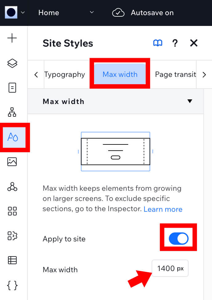
Boom! You’ve now set a global constraint for your content, but heads up…
Just Turning It On Might Not Be Enough
Turning on the Max Width at the site level doesn’t automatically apply it to every section, especially if you’ve added sections manually or used a full-width layout.
Sections can still override it.
So here’s what I usually do when I want a section to respect my max width:
- Head over to the Layers panel
- Click to select the section you’re working on
- On the right side (Inspector panel), look for Apply Max Width
- Toggle it on
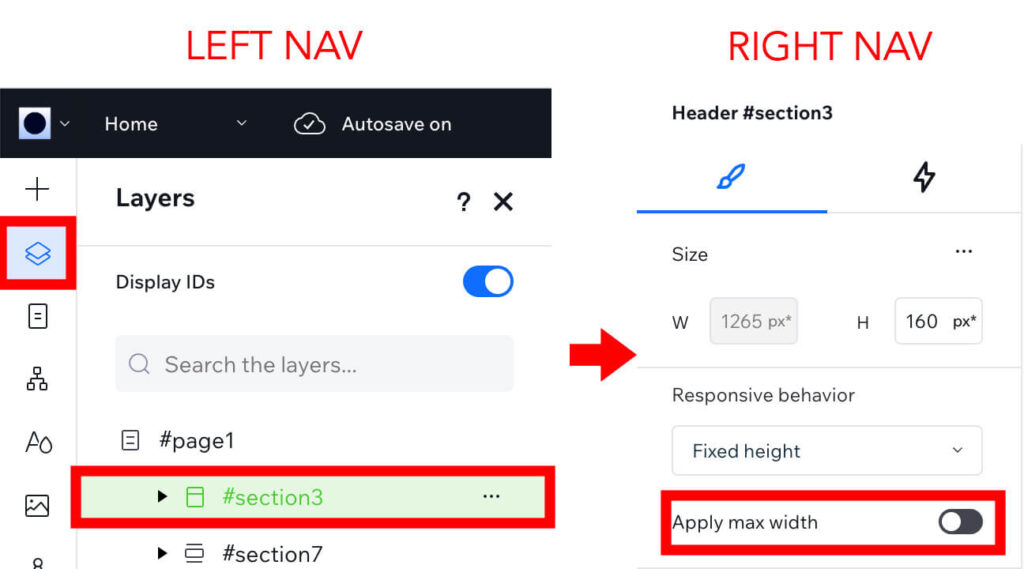
That’s it! Now your section will follow the max width you set in your site styles.
Quick Tip: If It Looks Like Nothing Changed…
Sometimes you’ll turn Max Width on, preview the page, and think: “Huh? It didn’t work.”
Don’t panic. This has happened to me as well.
Give it a second, or better yet, refresh your preview. I’ve found that changes like this don’t always render instantly, especially in preview mode. Another tip is to change something like the padding or margin and then try to preview. The additional changes sometimes trigger the preview to update too. In this scenario, once the preview is updated, I go back and remove the unwanted padding or margin.
When Should You Use Max Width?
Here’s when I reach for it:
- Writing-heavy pages like blog posts, FAQs, and About pages
- When I want the content to feel centered and tight
- For any design that needs a more refined, editorial feel
Of course, there are times when full-width is the right call — hero images, background videos, big visual sections. But if your text is swimming across the screen? I like to rein it in.
Wrap-Up
Max Width in Wix Studio might seem like a small setting, but it makes a huge difference in how your design feels, especially on big screens.
If you haven’t tried it yet, give it a spin on one of your site sections. Refresh your preview. Tweak it. It’s one of those pro-level touches that your visitors won’t consciously notice, but they’ll feel the polish.
Designing for readability? After setting a max width, ensure your breadcrumbs reflect the actual item titles for a cohesive user experience.
👇 Want to see it in action?
Here’s the YouTube tutorial that walks you through it.
Want More Wix Studio Tips?
If you’re getting into the flow with Wix Studio and want to go deeper, check out these two related posts from my hands-on experience as a designer working in the platform:
🧠 First Impressions Using Wix Studio as a Web & Graphic Designer
Curious how Wix Studio stacks up for professional designers? I break down my honest first thoughts after building real projects inside it, including what feels intuitive, what’s still clunky, and what I hope they improve.
🎨 Mastering SVG Icons & Repeaters in Wix Studio: A Web Designer’s Guide
From Illustrator to Studio, I show you how to bring in clean SVGs and use them with repeaters for sharp, flexible layouts. Bonus: how to make sure your icons stay crisp and scale perfectly on every screen.
Once you’ve dialed in your layout width, you may also want to restyle the colors inside a section. I put together a step-by-step tutorial on how to recolor text, SVGs, and divider lines in Wix Studio using custom CSS—without fighting the auto-generated class names.