
Why Heading Hierarchy Matters for Designers and SEO
As designers, we often think about look and feel first. How big should this headline be? What font weight makes it pop? How much space should we leave between sections?
But under the hood, browsers don’t see your page as colors or type sizes; they see a DOM tree (Document Object Model). And here’s the kicker…search engines rely on that same tree to figure out what your page is about. A sloppy hierarchy can literally bury your content in search results.
Understanding the DOM and heading hierarchy is crucial not only for accessibility but also for SEO. Let’s break it down.
What’s the DOM Tree, Anyway?
Think of the DOM tree like an outline of your HTML, except it’s alive. Every <div>, <p>, and <h2> is a node on a branching tree. Parent and child relationships form automatically based on your nesting. All elements in your HTML (even comments) are part of the DOM tree.
Example:
<body>
  <h1>My Blog</h1>
  <section>
    <h2>Introduction</h2>
    <p>Welcome to my blog post...</p>
    <h3>Background</h3>
    <p>Some context here.</p>
  </section>
</body>
If you could peek into the DOM, it would look something like this:
BODY
 ├── H1 (My Blog)
 └── SECTION
      ├── H2 (Introduction)
      ├── P (Welcome to my blog post...)
      ├── H3 (Background)
      └── P (Some context here.)
Notice how the headings form a clear hierarchy: H1 at the top, H2 under it, H3 under that.
Why Heading Hierarchy Matters
1. Visual Hierarchy ≠ Semantic Hierarchy
You might style an H2 to look smaller than an H4 — and that’s fine visually — but the DOM tree doesn’t care about type size. It only cares about semantic levels.
2. Accessibility
Screen reader users often jump between headings to scan a page. If your headings jump from H1 straight to H4, you’ve created a confusing outline.
3. SEO
Search engines use heading hierarchy to understand your content. A sloppy structure can send mixed signals — Google might think a minor subtopic is more important than your main point. Over time, this can weaken your search visibility.
A “Bad” Example
<h1>Portfolio Website</h1>
<h3>About Me</h3>
<h2>Projects</h2>
At first glance, this might look fine: a site title, an “About Me” section, and a “Projects” section. But in the DOM tree:
H1 (Portfolio Website)
 └── H3 (About Me)
H2 (Projects)
What’s wrong?
- “About Me” is an H3 with no real parent, so it dangles awkwardly in the outline.
- “Projects” is an H2, which makes it more important than “About Me,” even though they should be equal.
To a human eye, it might look okay. But to search engines and screen readers, this outline is confusing, like a table of contents where Chapter 3 comes before Chapter 2.
A “Fixed” Example
<h1>Portfolio Website</h1>
<h2>About Me</h2>
<h2>Projects</h2>
Now the DOM tree is clear and logical:
H1 (Portfolio Website)
 ├── H2 (About Me)
 └── H2 (Projects)
Why this works:
- “About Me” and “Projects” are equal siblings under the main heading.
- Screen readers and search engines get a clean, predictable structure.
- Search engines now see a clear outline: Portfolio Website → About Me and Projects — improving SEO because topic hierarchy is crystal clear.
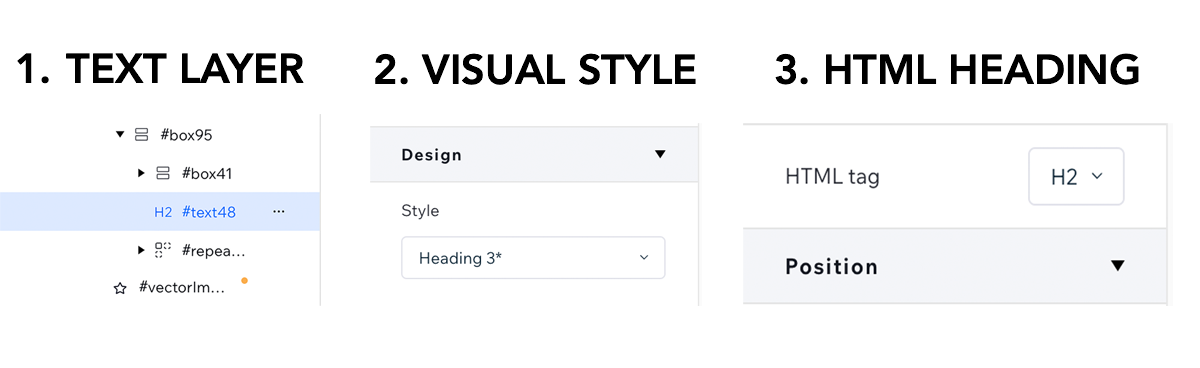
How This Plays Out in Design Tools (Wix Studio Example)
Here’s where design and code often get tangled. In tools like Wix Studio, you’ll see two different options when working with text:
- Design > Style Heading – controls the look: size, weight, color, spacing.
- HTML Tag Heading – controls the structure: H1, H2, H3, etc.
And here’s the important thing: these two can (and often should) be different.
For example:
- You might want a subheading to visually look like an H3 (smaller, lighter, styled that way).
- But in the DOM tree, it actually belongs as an H2 because it’s a major section heading.
That’s totally valid, and it’s the difference between visual hierarchy and semantic hierarchy.
👉 In Wix Studio, this is easy to do. Just:
- Open the Layers panel on the left.
- Select the text layer you want to edit.
- On the right, adjust both the Design Style Heading (the visual) and the HTML Tag Heading (the semantic).
In your DOM tree, the correct heading level gets applied, even if the text looks different in your design. This gives you the best of both worlds: clean design + clean hierarchy.
Watch my in-depth video on fixing my headline hierarchy.
Best Practices for Heading Structure
- Use one H1 per page (your main topic).
- Nest logically (H2s for major sections, H3s for subsections, etc.).
- Don’t skip levels (no H1 → H4 jumps).
- Style with CSS, not heading levels.
Wrapping Up
Clean heading hierarchy isn’t just a nerdy coding detail; it’s a design decision that impacts SEO, accessibility, and user experience all at once.
- Visual hierarchy helps your audience navigate quickly.
- Semantic hierarchy ensures your content is understood by screen readers and search engines.
- Website Builders like Wix Studio let you maintain both at the same time (style freely while keeping the DOM tree clean)
Think of it as invisible UX: you’re making your content easier to read for humans and machines alike. So next time you reach for an H3 because it “looks right,” pause. Ask yourself: where does this heading actually live in the DOM tree?
FAQs
There are many Chrome extensions. My current favorites are AHREF’s SEO Toolbar or Headings Map.
A semantic heading uses an html heading tag to clearly describe hierarchy to human users and machines. Semantic elements include semantic headings <h1>, <h2>, <h3>, <h4>, <h5>, <h6> and tags such as <footer>, <article>, or <nav>.